
|
SUMMARY:
It’s so easy to overlook the power of marketing. In the four examples in this article, absolutely nothing changes about the product itself. The only thing that changed was the writing and/or design used in its marketing. From those changes, performance improved. Don’t take for granted how powerful that is! It means the conversion increases you seek are within your grasp even if you don’t control product development or other aspects of the customer experience. Read on for examples from a home décor company that secured 25% more reviews, an organic mattress company that generated 167% higher conversion, plus more. |

(As seen in the MarketingSherpa newsletter. Click to get a free email subscription to the latest from MarketingSherpa.)
If people aren’t buying your product or responding to your offers, you may have the perception that your offers and products just aren’t good enough.
Certainly, many products and services can be improved. And while that’s going on, take a good hard look at how you communicate about your products and offers. Sometimes, you can simply improve your marketing while making no physical changes to the product and get significant results.
As marketers, it’s easy to take this for granted. But stop for a moment and think how powerful that is. Literally nothing can change about the product or offer, about what the customer physically receives, and yet customer value perception can increase so much that many more customers choose that product or offer.
To spark your next great writing or design change that will improve results for your products and offers, here are four examples from your peers to get you thinking.
What works better — a statement headline or a question headline?
OK, let me try this another way.
A statement headline will generate a higher conversion rate than a question headline.
Perhaps my first sentence raised some curiosity in you, but my second sentence actually gave you information. And in the few moments customers take to scan your landing pages, the difference between the two can be significant.
An organic mattress company had a series of anxiety-reducing headlines on its landing page:
The mattress company worked with MECLABS Institute to test different articulations of that anxiety-reducing information to improve conversion (MECLABS is the parent organization of MarketingSherpa).
Treatment A
Treatment A had the following headlines on the landing page.
Treatment B
Treatment B conveyed similar, although slightly different information, and two of the headlines took a question-based approach.
Treatment A generated a 166.7% higher conversion rate than Treatment B.
You can learn more about this experiment and use discoveries from it for your own marketing in this lecture from MarketingSherpa’s sister publication, MarketingExperiments: Conclusions Precede Decisions: Two case studies that teach the most effective way to amplify conversion. We have also embedded the video below for your convenience.
All marketing roads lead to the call-to-action. So even a minor improvement to the copy or design of a call-to-action can generate significant performance improvements for a company.
For example, Lucidpress is a software-as-a-service company with a freemium model. The company’s main goal is to drive higher registration rates of engaged users for the product.
All the calls-to-action on its pages had the language: “Sign up free.”
The team ran an A/B test to see if a CTA specific to the user’s motivation on the page would drive more registrations. Each CTA was updated to “Design a [keyword from the page].” The new CTA language drove a 5% increase in user registrations, people who clicked the button and then created an account. There was also a 6% increase in user engagement metrics, people who actually created a document after registering for the product.
When the team tried applying this same language (“Design a...”) in its template gallery, the copy reduced conversion. Instead, the wording “Customize a template” won.
Creative Sample #1: Most effective button copy for SaaS company’s template gallery

“We learned that understanding the intent of the visitor going to these pages is important when framing our product. Someone looking for a design tool is much more interested in designing a piece of content, while someone looking for a template is generally looking for an easy way to put something together without necessarily designing anything,” said Christina Sanders, Inbound Marketing Manager, Lucidpress.
Marketers can be intimidated about testing design to increase conversion because they are not designers. I know that isn’t my skillset.
But sometimes the most effective design is the simplest.
Ted's Vintage Art is an online retailer of digitally restored maps from the late 1800's and early 1900's.
“Product reviews — from our main website, Etsy store, Amazon store, eBay store, etc. — are critical on all online selling platforms as they not only influence future purchasers, but oftentimes they are factored into ranking algorithms in marketplaces like Etsy and Amazon,” said Justin Blase, Founder, Ted’s Vintage Art.
(You expected his name to be Ted, didn’t you? I asked him about that. He felt justinsvintageart.com would be too long, and he wanted to tie the branding to Teddy Roosevelt, who was a prominent figure in the era Blase is selling maps for. Bully!)
The home decor company sends an automated email to product purchasers after they receive their item. The goal of this email is to encourage the purchaser to leave a positive review for the product on whichever site it was purchased.
For a few years, up until about 12 months ago, Blase sent a beautifully crafted HTML email. When I looked at a landing page, I could instantly see why he took that approach. He sells a beautifully crafted product. Here’s an example vintage map of MarketingSherpa’s hometown of Jacksonville, Florida.
Creative Sample #2: Product landing page for home décor company

That email was able to convert approximately 15% of buyers to leave a review, which varied greatly by platform. “[It is] much harder to get reviews on a platform like Amazon.com, for example — since they don't give you the personal email address of the buyer, only a ‘transactional email address owned by Amazon — versus our WooCommerce site where we can get directly into the inbox with an automated sequence,” Blase said.
Here’s a look at that email.
Creative Sample #3: Designed HTML email for home décor company

In February 2019, Justin tested using the same email content, but instead of using a nicely designed HTML email template, he used a plain text email that was personalized.
Creative Sample #4: Plain text email for home décor company

After receiving the plain text version, 25% of buyers leave a review.
“I have heard of others receiving large performance lifts by stripping down email to a plain-text, personalized approach. My hypothesis is that the email looks like it was manually typed up by me ... so it's just a lot more personal in appearance. I think the old email had a bit of a ‘templated’ look to it that didn't generate as much of a response,” Blase said.
“I recommend all marketers test a plain text email approach at some point, even if it just a one-time test. I think many will be surprised to see a lift in engagement,” he advised.
“Letters, we get letters, we get sacks and sacks of letters ... letteeeeeeers!” Paul Schaffer used to play this song when David Letterman opened up his mail bag.
I can relate. We get tons and tons of pitch email. And most of it is so focused on the sender. “Include my link … mention my client’s product … publish my guest post … me! Me! Me!”
So when an email gets past The Linda Filter, it grabs my attention. The Linda Filter is not a high-tech piece of AI wizardry. Linda Johnson is a person, and she sorts through most of our email.
To break the third wall for a minute, I don’t read most of the email addressed to me. If you’ve ever replied to a MarketingSherpa newsletter email send and were surprised at the personal response you’ve gotten, it’s only because Linda is sorting through all the noise to find the humanity for us, and flagging up the real emails from real (non-sales) people who we should respond to. Thanks Linda!
So when Linda forwarded an email and wrote, “I had to pass this one on to you, Daniel. I give her an A for effort,” I had to learn the story.
This is a common challenge for many in sales and marketing — how to get past the gatekeeper. Back when I used to work with direct mail, a classic way to get past the gatekeeper was to send a dimensional mailer with an actual gift — a baseball bat, a personalized pen, an Atari.
But dimensional doesn’t work in email. So it takes better writing.
Let’s take a look at the example Linda flagged up. Aiste Macyte, who works in content marketing for Sleeknote, used to send an email like this …
Hi Daniel,
I was commuting to work this morning, reading a few articles in Pocket, when I came across your post, "https://sherpablog.marketingsherpa.com/email-marketing/behavior-based-crm-tactics/"
Not only did I almost miss my stop while reading it, but I also shared it with my colleagues (who seemed to enjoy it just as much, if not more...)

It stood out for me as I’ve just finished working on a post on e-commerce statistics called "The 115 Best Email Subject Lines We’ve Ever Seen"
In it, we share 115 interesting examples, statistics on e-commerce, with tips and takeaways on how e-commerce businesses can prepare for the coming year.
I know it’s a bit cheeky, but maybe it will make a nice addition to your post?
If not, no worries; my colleagues and I will look out for your next post :)
Cheers,
She changed it to …
Daniel,
I thought long and hard about how I could get your attention in this email.
I considered taking an image of me introducing sherpablog.marketingsherpa.com to a colleague...

I even considered buying you a cup of your favorite coffee (decaf latte, right?)

But, ultimately, I decided to do away with the gimmicks, and instead, be direct:
Thoughts?
P.S. We’ve written before for Typeform, JotForm, Keap, ConversionXL, to name a few sites. But if you need more writing examples, let me know and I’ll send something over. :)
Warmest,
|
Best Regards Aiste Macyte |
Astute observers will note that the personalized screenshot actually includes the homepage for MECLABS, not the MarketingSherpa blog, but we probably have a more complex setup than others she is pitching since we have multiple sites.
So did we publish a guest post? No, because we do that only very, very rarely. But I appreciate three things about this email:
Now, as I said, I never did take Macyte up on that offer. Follow through would be critical for this pitch email approach.
According to Macyte, this new approach is getting her more traction.
“With [the original] email our reply rate with sending it to ~ 200 emails was 4%, while now, with the new one it is around 15%, and we just started the new campaign with way smaller amounts of emails used for it. So I believe the numbers talk for themselves. Personalization and a tiny bit of humor is helping us a lot!” Macyte said.
“Think outside of the box and remember that the email you send is like a sneak-peak to your brand, your tone, and overall creativity level. If people you write for don't know you, the email is like their first impression of what you are all about,” Macyte advised.
Blandvertising: How you can overcome writing headlines and copy that don’t say anything
Conversion Rate Optimization: 7 tips to improve your ecommerce conversion rates
Defining the Marketing Message: 4 examples of optimizing customers’ perception of value
Get Better Business Results With a Skillfully Applied Customer-first Marketing Strategy

The customer-first approach of MarketingSherpa’s agency services can help you build the most effective strategy to serve customers and improve results, and then implement it across every customer touchpoint.
Get More Info >MECLABS AI

Get headlines, value prop, competitive analysis, and more.
Use the AI for FREE (for now) >Marketer Vs Machine

Marketer Vs Machine: We need to train the marketer to train the machine.
Watch Now >Live, Interactive Event

Join Flint McGlaughlin for Design Your Offer on May 22nd at 1 pm ET. You’ll learn proven strategies that drive real business results.
Get Your Scholarship >Free Marketing Course

Become a Marketer-Philosopher: Create and optimize high-converting webpages (with this free online marketing course)
See Course >Project and Ideas Pitch Template
A free template to help you win approval for your proposed projects and campaigns
Get the Template >Six Quick CTA checklists
These CTA checklists are specifically designed for your team — something practical to hold up against your CTAs to help the time-pressed marketer quickly consider the customer psychology of your “asks” and how you can improve them.
Get the Checklists >Infographic: How to Create a Model of Your Customer’s Mind
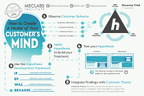
You need a repeatable methodology focused on building your organization’s customer wisdom throughout your campaigns and websites. This infographic can get you started.
Get the Infographic >Infographic: 21 Psychological Elements that Power Effective Web Design
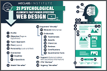
To build an effective page from scratch, you need to begin with the psychology of your customer. This infographic can get you started.
Get the Infographic >Receive the latest case studies and data on email, lead gen, and social media along with MarketingSherpa updates and promotions.