
|
SUMMARY:
When you think of web design, your mind might immediately go to the all-encompassing project that is a full-on website redesign. These projects can generate significant results. But they require a large monetary, time, and even political capital investment. So in this article we’ll touch on full redesigns, of course, but we’ll also look at some relatively small changes to a nav, CTA, and reg page that had a big impact. Read on for specific examples from a natural foods CPG, travel website, real estate agent, and nutrition and lifestyle app. |

(As seen in the MarketingSherpa newsletter. Click to get a free email subscription to the latest from MarketingSherpa.)
There’s a house across the street from me. It was foreclosed on. Fell into disrepair. Was in a pretty hopeless state. Some investors bought it up six months ago and have been working on it every day since. It went on the market yesterday and — wow — it looks like a new house.
There is another house around the corner from me. It recently got a fresh paint job and a little yard work, and also, it’s like a whole new house.
Your website and apps are no different. Sometimes you need to strip it down to the studs (or depending on how old those technological bones are, just knock the whole thing down) and do a full redesign.
Other times, what you have is mostly good, but identifying that key change or two — planting that metaphorical tree in the front yard and painting the trim — will gain you the performance increase without a massive investment.
In this article, we look at four mini case studies featuring web design changes large and small to spark ideas for improvements on your own sites.
Marketers are so focused on and passionate about their products, they don’t always have the fresh perspective needed to communicate their product’s value to a new customer through the web.
Take Steve Diebold, for example, the entrepreneur behind Papa Steve’s No Junk Raw Protein Bars. I can attest, he makes some very good protein bars. He’s also a smart and passionate guy I’ve had the opportunity to get to know a little, and there’s much more to these bars than taste. He’s put a lot of thought and work into them.
How do you communicate that on a website? Here was Diebold’s original site.
Creative Sample #1: Original website for natural foods CPG site

You can see, he’s trying to get a lot across right at the beginning of the website.
He was successful in growing his business and felt it was time to take his website to the next level.
Diebold worked with MECLABS Institute Conversion Marketing Services to bring in an outside perspective for the website redesign (MECLABS is the parent organization of MarketingSherpa).
The team determined that one of the biggest areas of opportunity for this food products supplier was the expression of the value proposition — there was no differentiation messaging clearly explaining why this bar is superior to other bars.
For example, it was hard to understand the ingredients from a differentiation standpoint on the homepage. A dedicated ingredients page had some good information, but it was not being seen by most visitors and could be improved and leveraged on the homepage.
In addition, taste was a key differentiator compared to competitors but there was little messaging about it.
On the redesigned, optimized website, the team sought to better articulate differentiated value.
The new homepage communicated the superior ingredients in a clear (and shorter) headline that greeted visitors:
“ALL NATURAL, NO JUNK, NON-GMO RAW PROTEIN BARS”
And the subhead communicated the taste:
“That Actually Taste Good!”
Creative Sample #2: Redesigned website for natural foods CPG company

Since the redesign was launched, the overall conversion rate (total orders/total visitors) is up 18%, and overall revenue increased 18% as well. You can read the full case study to see what other changes were made to the site, Website Development: How a small natural foods CPG company increased revenue 18% with a site redesign.
“You can always find a new traffic source, but the sequencing of the story on your website is really critical. If you get that right, you can give people a better experience, and your sales are going to be better, and the business is going to benefit because the customer feels they're benefiting. And if you're truly providing value to customers and they feel that they're getting value, they’re going to keep doing business with you,” Diebold said.
This case study was featured in The 21 Psychological Elements that Power Effective Web Design (Part 1) from MarketingExperiments (MarketingSherpa’s sister publication).
For most websites, the goal of the homepage should be to get visitors to the part of the website that can best serve them.
When Masai Mara Travel’s IT team noticed significant visitor bounce rates from its homepage, the website’s main entry point, they realized they needed to look at some possible improvements. The company focuses on travel to a national reserve in Kenya.
Its team conducted a short survey of visitors and referenced heat maps of user behavior. “We realized the design of the page, with the navigation menu hidden in a drop-down menu style (also known as a hamburger menu) while very attractive, was confusing to some of our users, especially those in the over 50 years of age bracket — one of our target age demographics for the luxury safari tourist,” said Sanjay Shoor, Operations Director, Masai Mara Travel.
Creative Sample #3: Homepage with hamburger menu for travel website before redesign

After redesigning the homepage with a more noticeable and stand-alone navigation menu bar, the company immediately saw an increase in website clickthrough rates and a 40% increase in on-site engagement rates.
Creative Sample #4: Homepage with new navigation menu for travel website after redesign

“For desktop, we found users were more used to not having a drop-down menu, very possibly because the more mature web user demographic still prefers doing their heavy browsing or online research on large formats, i.e., either tablet or more commonly desktops, especially so when planning their long-haul travel, which can be an involving online process with plenty of switching between different websites to compare offerings,” Shoor said.
For mobile, the space limitation still necessitated use of the hamburger menu. However, the team moved the menu from the right side of the logo to the left side since user-click heat maps indicated the highest eyeball activity on the left side of the screen. “This did improve click rates to secondary pages somewhat,” Shoor said.
Creative Sample #5: Mobile homepage for travel website after redesign

Sometimes the design issue holding a webpage back isn’t what we think of as design at all — the colors, images, layouts, pictures, etc. — it’s that an element is hidden or entirely missing from your page.
After all, marketers shouldn’t just be utilizing design for design’s sake. They should use design to encourage an action.
The team behind the website for Orange County Realtor Kristina Morales wanted to increase the amount of home showing inquiries submitted on the website’s property page.
The overall conversion rate on the property search page was under 0.5%, and a redesign was considered.
Creative Sample #6: Property search page for real estate website

“Before completely redesigning the page, we looked at our analytics and found out that there was nothing wrong with the current design. Visitors were engaged and stayed on the page for a while,” said Oleg Donets, Digital Marketing Strategist, Kristina Morales real estate.
However, the team noticed that the main CTA was easily lost on the page. “Schedule Consultation” was quietly sitting in the upper right.
Creative Sample #7: Sticky CTA for real estate website

The conversion rate increased to 4.5% solely due to the addition of the prominent sticky CTA to the existing website design.
Creative Sample #8: Sticky CTA on property search page for real estate website

“I did not realize that such a small change to my website would have such a big impact on my showing requests,” Kristina Morales said. “Staying on top of website improvements and development are key to sustainable, long-term growth.”
If you’ve read MarketingSherpa for any length of time, you know that the biggest battle most marketers wage is not really with competitors, it’s with our assumptions. One way to test those assumptions when building an app is to prototype the app and get customer feedback that either validates or challenges your thinking.
Habitap was built by a gym with a focus on building a healthy lifestyle by creating nutrition and lifestyle challenges to help people build better habits. The original site had very poor user engagement.
Creative Sample #9: Dashboard in original nutrition and lifestyle app

Topflight Apps worked with the gym to adapt the challenges into a web application that works in any browser (the previous iteration did not display well on mobile). In the process, it also worked to glean insights on key elements for the challenge app.
“We then verified our findings in the form of a prototype with their gym members. In essence, our job was to align the gym and gym members’ goals,” said Joe Tuan, CEO and Founder, Topflight Apps.
The prototype re-affirmed some elements of the app’s design:
Creative Sample #10: Updated dashboard in nutrition and lifestyle app

Creative Sample #11: Updated nutrition and lifestyle app home screen on mobile

The prototype also brought up challenges with the design. For example, a few testers had an issue with the payment during the registration step. The payment amount and what you were buying were unclear. That’s because the Habitap team thought it wasn't necessary since the pricing structure was noted on the website, which is how people get to the registration.
However, based on this customer feedback, the lead designer added the payment amount and product/s being purchased before taking customers’ payment information.
“I thought it’d be best to add into the design how much they will be paying and why before taking customers’ payment information, as that’s not really something people enjoy doing without transparency — even if they could already know how much the program costs from the link through which they arrived at the site. I felt it was better to be redundantly transparent when accepting payment methods, just in case,” said Nathan Freemyer, UX/UI Team Lead, TopFlight Apps.
In the screenshot below, you can see the final registration page built based on customer feedback from the prototype — customers can see that they are paying $95 for a 10-week challenge.
Creative Sample #12: Final registration page for nutrition and lifestyle app

As a result of the updated app, based on prototyping and validating the app with end users, participation in the nutrition and lifestyle challenges increase dramatically.
“We had more people sign up for our current challenge than who signed up in all of last year’s challenges combined,” said Chad Cole, Founder, Habitap.
Get The 21 Psychological Elements that Power Effective Web Design Infographic
Get Better Business Results With a Skillfully Applied Customer-first Marketing Strategy

The customer-first approach of MarketingSherpa’s agency services can help you build the most effective strategy to serve customers and improve results, and then implement it across every customer touchpoint.
Get More Info >MECLABS AI

Get headlines, value prop, competitive analysis, and more.
Use the AI for FREE (for now) >Marketer Vs Machine

Marketer Vs Machine: We need to train the marketer to train the machine.
Watch Now >Live, Interactive Event

Join Flint McGlaughlin for Design Your Offer on May 22nd at 1 pm ET. You’ll learn proven strategies that drive real business results.
Get Your Scholarship >Free Marketing Course

Become a Marketer-Philosopher: Create and optimize high-converting webpages (with this free online marketing course)
See Course >Project and Ideas Pitch Template
A free template to help you win approval for your proposed projects and campaigns
Get the Template >Six Quick CTA checklists

These CTA checklists are specifically designed for your team — something practical to hold up against your CTAs to help the time-pressed marketer quickly consider the customer psychology of your “asks” and how you can improve them.
Get the Checklists >Infographic: How to Create a Model of Your Customer’s Mind
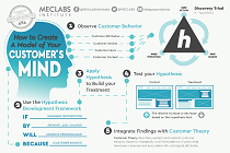
You need a repeatable methodology focused on building your organization’s customer wisdom throughout your campaigns and websites. This infographic can get you started.
Get the Infographic >Infographic: 21 Psychological Elements that Power Effective Web Design
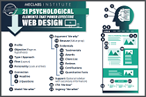
To build an effective page from scratch, you need to begin with the psychology of your customer. This infographic can get you started.
Get the Infographic >Receive the latest case studies and data on email, lead gen, and social media along with MarketingSherpa updates and promotions.