|
SUMMARY:
After issues with a cart abandonment campaign sending the wrong information to customers, Golfsmith marketers reviewed an email program to optimize it, and were able to identify shoppers who browsed one or more products multiple times without completing a purchase. |
by Courtney Ecklerle, Senior Manager of Editorial Content
THE CUSTOMER
Golfsmith International is the largest specialty golf retailer in the world, consisting of the Golfsmith brand in the United States and the Golf Town brand in Canada. The company has more than 160 experiential stores, as well as ecommerce through golfsmith.com and golftown.com.
"We have an incredible selection of the best brands in golf, expert staff who share our customers' love of the game, and state-of-the-art custom fitting to help players of all skill levels find the perfect clubs just for them," Kim Lewis, Vice President of Omnichannel Marketing, Golfsmith.
The goal, Lewis said, is to help "every player look, feel and play their best. Really, our customer is anyone who plays golf, or even just enjoys the golf lifestyle."
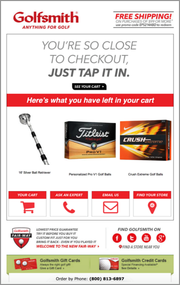
Lewis and her team had a major challenge on their hands, as the abandon cart email campaign was sending out the wrong information to customers.
Lewis' initial goal with this campaign was simple: "We just wanted to send the right information to the right people."
Beyond that, she and her team developed fairly conservative ROI targets aimed at increasing the average order value.
"This was something we saw as a table stakes campaign that we needed to be doing. We wanted to not only check that box and then generate some incremental revenue, but we were being very conservative with that the projections," she said.
In December 2014, after the issues with the cart abandonment campaign, Golfsmith reached out to a new automation vendor to work with on the program.
"We knew we needed a partner that could deliver. The success of a program like this is completely based on it being the right information to the right customer at the right time. That's what makes it so powerful," Lewis said.
Despite the modest KPI goals, Lewis said, "The engagement and the revenue started coming in literally within the first hour … and it just kept growing. We've been really thrilled with the results."
To begin, Lewis and her team had a kickoff meeting to review vendor capabilities, choose an appropriate message layout, and craft the overall approach.
"We wanted something that was clean, eye-catching and fairly simple, but we wanted it to reflect our brand look and feel," she said.
This meant ensuring the email and website experiences tied together using behavioral and purchase data, and that email content was echoed online.
At that point, Golfsmith developers tagged the site so the vendor tool could identify customers and their behaviors, pulling in the dynamic elements to contribute to personalization. Then, the design team created the template, with dynamic elements that pulled in coded, personalized information.
Lewis said, the design was "very simple. … We wanted to keep it very streamlined. It's even more simple than our regular email header because we have a very singular focus of what we're wanting the customer to do."
Those few elements helped focus customers on coming back to the website, reclaiming their carts and converting, she added. Those elements included:
"Then, of course, a call-to-action to go back their cart and complete their purchase," she said.
"If you come to our site and we are able to identify you, that means you either came through one of our emails, or at some time you've provided your email address. We then have the ability to reach back out to you," Lewis said.
A customer is browsing and clicking on products, and adds them to their cart.
"Then, for whatever reason, maybe you're not ready to buy, maybe the doorbell rang or the phone rang, and you had to step away," she said.
An hour after the customer abandons a cart, the first cart abandonment email arrives from Golfsmith.

Click to see a larger, printable version of the chart
"We tell you you're so close, and encourage you to finalize that purchase and hope that you'll convert there. Certainly we've seen a tremendous amount of engagement with that first drip," she said.
If a customer still doesn't complete their purchase, a follow-up email is sent approximately 48 hours later with a similar message "to remind you that the items are there and to encourage you to complete the purchase."
Typically, that's where the abandoned cart program ends, Lewis said.
"We've had some specific instances where we will come back with a final chance email right before your cart is about to expire, but that is not always the case," she said.
Her team calls those instances "mop-up campaigns," and those are done in a targeted timeframe. For example, she said, leading into the peak holiday season last year, when updates were needed on the website platform.
"[The updates were] actually going to require us to clear out all of the carts on our site well before that would normally occur. We sent a final chance email to all of our customers to let them know that their cart was going to be cleared out," she said.
Many customers use their carts as a repository to save items they want to go back and purchase later, especially leading into the holiday season, she said.
"We didn't want to surprise customers or catch them off guard when they came back to an empty cart. We also had really great success with that program. It did lead to incremental purchases," she said.
"We went through a few rounds of testing to ensure that everything was perfect, that the feed was properly populating the information into the template. Then we set it to go live," Lewis said.
These rounds of testing meant feeding in sample files where the team would purposefully abandon carts.
"We would do different scenarios – abandoning one item, abandoning three items, abandoning 12 items. Make sure that the data would properly flow through from our website to [the vendor], then over to our email service provider, and ensure that the template then rendered with the correct information, and that the layout would transform the way we had expected it to depending on the number of items," she said.
When initially launching the program, the team did A/B tests with different headlines to see "what was going to do the best job of catching customers' attention and encouraging them to convert."
That test was run for a fairly brief amount of time, she added, as there was a clear winner to move forward with.
"We've been so happy with the results that there's very little that we've changed since that initial launch. It's one of those, if it's not broken, why fix it? Plus, that's also one of the benefits of the program – building it once and continually reaping the rewards without incremental effort," she said.
However, she added, the template will most likely be given a facelift this year heading into the holiday season.
Then, Lewis and her team also developed a browse abandonment campaign.
"Customers who have come in, browsed a few items, but did not take the steps to put it into their cart — we launched a program for that as well. We've also seen positive results for that," she said.
By targeting customer behavior, specific even to certain brands or product categories, Lewis and her team have been able to launch very targeted campaigns based on that customer behavior.

Click to see a larger, printable version of the chart
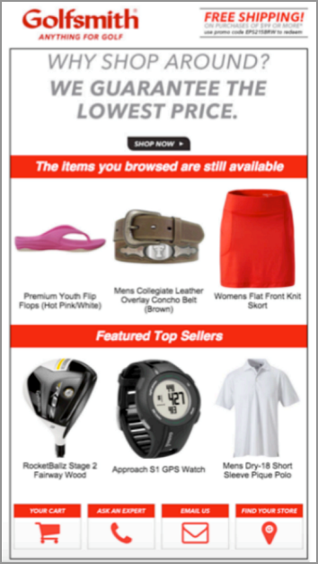
The browse campaign was initially extremely similar to the abandoned cart email, Lewis said, only highlighting three items the customer had browsed.
"Engagement was strong, with a 46% open rate and 11% clickthrough rate. But once this campaign had been running for a few months, we saw an opportunity to increase AOV via cross-sell and up-sell," she said.
The team worked to add another content block, highlighting three top sellers. Once this component was added, conversion increased 67% and AOV increased 11%.
"The whole point of an abandoned cart campaign is to re-engage the customer. First and foremost, the primary goal is to get them to open the message, get them to click through, return to the site, and re-engage in the shopping process. Far and away, that has been a resounding success," Lewis said.
The cart abandonment email, according to Lewis, consistently gets over a 50% open rate and a 16% clickthrough rate.
The additional results driven once top sellers were added to the browse abandonment email were:
"The residual conversion and income from it, of course, is the long term goal. This has consistently been a continuous revenue stream coming in without incremental design effort on our side," she said.
One of the greatest signs of the success of this campaign is that it has been expanded into other areas — most notably, from golfsmith.com to the Canadian golftown.com.
"Part of why this has been so powerful for us is because of the consistent revenue stream it produces while freeing up our internal resources to do other creative things. It really opens up our possibilities of what we're able to do outside of these programs because we know that we can count on them to deliver results," she said.
Email Marketing: First-time cart abandonment campaign drives a conversion rate 1,858% higher than weekly send
Online Cart Abandonment: 12% lift in captured revenue through customer service-focused email remarketing campaign
E-commerce: Moving beyond shopping cart abandonment nets 65% more checkout conversions
Get Better Business Results With a Skillfully Applied Customer-first Marketing Strategy

The customer-first approach of MarketingSherpa’s agency services can help you build the most effective strategy to serve customers and improve results, and then implement it across every customer touchpoint.
Get More Info >MECLABS AI

Get headlines, value prop, competitive analysis, and more.
Use the AI for FREE (for now) >Marketer Vs Machine

Marketer Vs Machine: We need to train the marketer to train the machine.
Watch Now >Live, Interactive Event

Join Flint McGlaughlin for Design Your Offer on May 22nd at 1 pm ET. You’ll learn proven strategies that drive real business results.
Get Your Scholarship >Free Marketing Course

Become a Marketer-Philosopher: Create and optimize high-converting webpages (with this free online marketing course)
See Course >Project and Ideas Pitch Template

A free template to help you win approval for your proposed projects and campaigns
Get the Template >Six Quick CTA checklists

These CTA checklists are specifically designed for your team — something practical to hold up against your CTAs to help the time-pressed marketer quickly consider the customer psychology of your “asks” and how you can improve them.
Get the Checklists >Infographic: How to Create a Model of Your Customer’s Mind

You need a repeatable methodology focused on building your organization’s customer wisdom throughout your campaigns and websites. This infographic can get you started.
Get the Infographic >Infographic: 21 Psychological Elements that Power Effective Web Design

To build an effective page from scratch, you need to begin with the psychology of your customer. This infographic can get you started.
Get the Infographic >Receive the latest case studies and data on email, lead gen, and social media along with MarketingSherpa updates and promotions.