by
Courtney Eckerle, Managing Editor
THE CUSTOMER
DollarDays International started in 2001, according to Marc Joseph, CEO and President, DollarDays International, because they felt that the internet was going to become the next channel distribution for wholesale and closeout products for small businesses.
This has led to over a decade of serving the company’s core customer base of “mom-and-pop stores who are surviving and thriving against the chains,” he said.
“We carry a little over 225,000 products on our site. If you walked into a Macy's or a Target or a Walmart, we carry all the categories of products you'd find in those kinds of stores,” he said.
He added that when customers come to the site, they buy products by the case, which are then shipped to their stores so they are able to compete with the chain stores in their area.
An interesting opportunity arose when DollarDays began to see customers coming from nonprofit organizations in the aftermath of Hurricane Katrina.
“They were looking for blankets and sheets, and underwear and socks, toothpaste and toothbrushes, and that's all kinds of stuff that we sell,” Joseph said.
All of a sudden, he said, “The marketplace made us very aware that there's a real opportunity to help in nonprofit organizations and churches and schools that support their causes.”
Now, he said, 45% of DollarDays’ business is for nonprofits that are supporting different causes, and 45% is focused on small businesses. That leaves 10% for different outliers that don’t fit into a major category.
CHALLENGE
Since the company started in 2001, the website hadn’t been through a major redesign in 13 years. This meant the site did not specifically welcome this new nonprofit customer base, and it needed an overhaul to appeal to customers overall.
“We looked like a business-to-business site before we did all this revamping. It was very staid. … It wasn't exciting. But we realized early on, and I think the rest of the B2Bs are coming to that realization today, is [that] we have to act like a B2C site,” Joseph said.
The site can’t be stagnant, he said, because as internet shoppers become savvier, B2B sites have to fit into their expectations of what a shopping experience will be like.
“Ten years ago, most manufacturers, distributors, wholesalers could afford to send somebody into your place of business. They'd sit across the desk from you, they pull out their samples, and then you buy that way,” he said.
In today’s world, he said, that’s not feasible for most businesses, especially not for DollarDays, which caters to many small businesses and nonprofits.
“That's why we have always felt that the internet helped level the playing field, and helped give this new channel of distribution so that small businesses can go onto our site, see things that are seasonal, they're needed, they're hot, and can immediately buy rather than have to go through the other ways to do business,” he said.
CAMPAIGN
DollarDays’ website redesign began with a website audit to identify key problems to be solved with the next iteration.
After identifying the problems, the team executed a redesigned website that put customer experience first within elements such as browsing products, account registration, checkout and payments.
The company needed to talk to three different customers in this website re-design, Joseph said:
- Small businesses that “need to be able to find products at the right price at the right time so they can compete in their marketplaces.”
- Nonprofit organizations so they know “we can help them with just about anything they need to support their causes.”
- Miscellaneous customers who “just found our site, and [we can] say, ‘Hey, you can buy from us, too.’”
Catering to those three customer bases is what shaped the current website design, and all of the elements integrated, including mobile and social.
Step #1. Conduct a website audit
The key problems discovered in the website audit were all keeping customers from having a simple shopping experience — the experience that most B2C sites offer.
The key problems discovered in the audit were:
- A lack of registrations. Buyers were required to register an account before viewing pricing, and so this first key conversion point for users on the website presented too much friction.
- A non-mobile friendly experience. Mobile users were discovered to be a growing segment for DollarDays, and the current experience didn’t tailor to these users.
- A drop-off in users due to slow page load speeds. On average, pages were loading in 12 seconds, and sometimes significantly longer. This was solved by making technical changes to the website code to decrease page load times.
- Page layouts that over-emphasized third-party ads. This element of the old website was to the detriment of new account registrations and product sales. This was solved by reducing the quantity, as well as moving them to more strategic positions on the page that would keep the DollarDays product front and center for the user.
- A lack of competitive differentiation. While DollarDays specialized in products and customer service geared especially for small retail shops and nonprofits, this wasn't clear from the website messaging and design.
After identifying these problems, the team executed a redesign process that with the goal of providing an entirely new customer experience on the website for each step in the purchase path — from browsing products and account registration, to checkout and payment.
Step #2. Layout the site with customers in mind
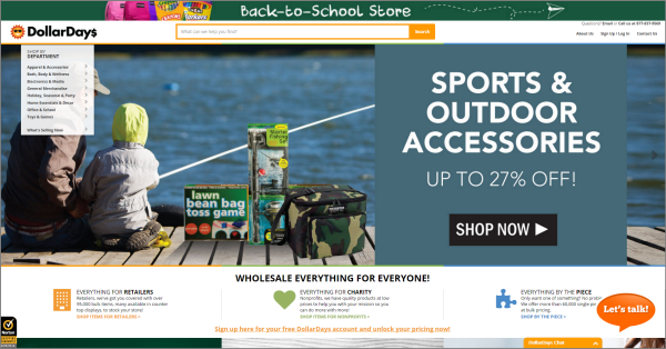
The way that the website is currently laid out, there is a rotating carousel of hero banners that changes with popular or seasonal items. It usually features at least one item that will appeal to small businesses, and one that will appeal to nonprofits. Previously, the website had been far more stagnant, according to Joseph.
“We try to be able to take care of all of our customer bases with the product assortment that we do have,” he said, and the website’s job is to ensure those products get in front of the customer.

Click to see a larger, printable version of the chart
Scrolling down the site from the hero banner shows sections labelled, “Everything for Retailers,” “Everything for Charity,” and “Everything by the Piece” — the last of which is a collection of DollarDays’ 60,000 single piece items.
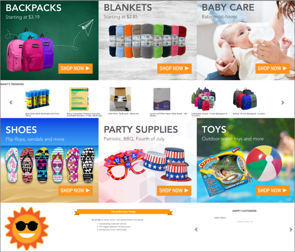
Then, featured departments are shown — currently, backpacks, blankets and baby care. That is followed by “What's Trending,” which shows “exactly what customers are buying or what they bought yesterday, what they bought last week,” Joseph said.

Click to see a larger, printable version of the chart
“Again, it's a combination of what stores are buying, what nonprofits are buying, and then you can see we have shoes and party supplies and toys are big for us. So that's how the redesign all came together is we needed to be able to talk to our customer base in several different ways,” he said.
This redesign was all about focusing on core customers, Joseph said, and making it easier for small businesses and nonprofits to find DollarDays, and be successful.
“If you're a small business, where do you find goods? Well, you could go to [trade] shows. … But it's expensive for a small business to go to show. … You could be away from your business for three or four days,” he said.
Another way a lot of manufacturers and distributors operate is to send out catalogs.
“So you get a catalog, you sit down in your office a couple weeks later, you decide what you're going to buy. But, first of all, you don't know if it's still in stock until you call the company and see if it is. Second, you don't know what new [products] came in since they sent out that catalog,” he said.
That process is why he employs 20 inside salespeople to work directly with small businesses on the website. The sales team quickly and efficiently directs customers to the best possible products for them while they browse the website.
With the redesigned website, there is greater communication about which products are selling, and Joseph’s inside sales team can work with customers from all 50 states and help inform them what is popular elsewhere.
The sales staff becomes “the face of DollarDays … and give you more confidence to what you’re buying, what is in demand in other parts of the country, and you’ll be [purchasing] the right thing,” he said.
Recently integrated into this redesign was a chat function on the website. It allows new customers could reach out to a chat specialist to quickly answer a question.
“As we build a site, we have to make it easy as possible when somebody wants something, for them to buy it. We've got to get rid of all the noise, and I think that's pretty much what we did as we redesigned our site and as we grew. … We're trying to get rid of all the noise so people can quickly and efficiently buy what they're looking for,” he said.
Reduce registration fields When it comes down to DollarDays’ evolution from a hardcore B2B business to a softer B2B business with some of the aspects of B2C to it, Joseph said, the key to that transition was being able to “quickly get people to buy what they're looking for, and you [have] to take away as much friction as you possibly can.”
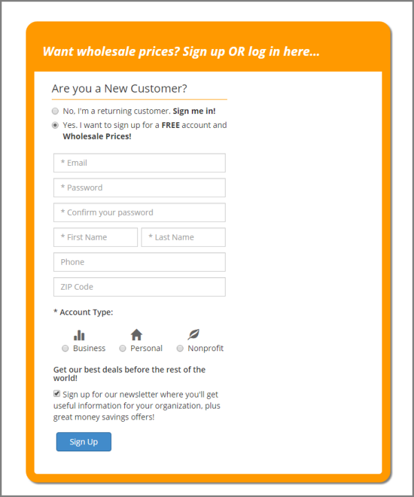
One area of friction identified in the audit was customer registrations — there were simply too few of them. This is an essential conversion step since buyers are required to register an account before viewing product pricing.
“We made our registration much quicker. There are a couple reasons why we require our customers to register. One is we want our customers to know we're not showing prices to the world. If you're a gift shop in small town America, we want you to know that your customers aren't seeing the same prices as you are. You have to register with us because we've got wholesale, closeout prices,” he said.
The second reason is it gives DollarDays a chance to reach out to customers who have been on the site, and have been interested enough to register for an account.

Click to see a larger, printable version of the chart
By reducing the number of form fields required to just what is absolutely needed at this conversion point, the team also reduced friction.
This saw a 24% increase in account registrations, and they continue to see daily increases in registrations, according to Joseph.
“On Monday [June 20, 2016], we had 1,388 new customers register with us. Last year, it was 1,139. So we had 249 more new customers register with us on Monday than we did [on the same Monday of] last year. … Tuesday, we had 1,398 versus 1,211 last year, so we had 187 more,” he said.
By streamlining this process, the team is increasing the number of customers who are interacting with DollarDays in the future, hopefully continuing them down the purchase path.
Step #3. Identify and integrate key value propositions
“You really have to figure out why does your customer want to buy from you. And the way I look at it, we [have] five different reasons why customers come to us,” he said, adding that those five value points needed to be emphasized on the website. They are:
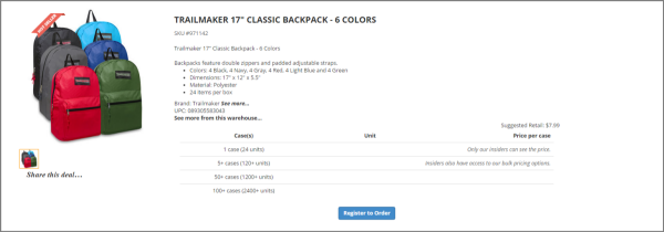
Price “Most of our customers are buying our goods, then reselling them to consumers. We have to make sure that we are priced right so that they can make money. So as you go through our site you'll see that we identify a lot of closeouts,” he said.

Click to see a larger, printable version of the chart
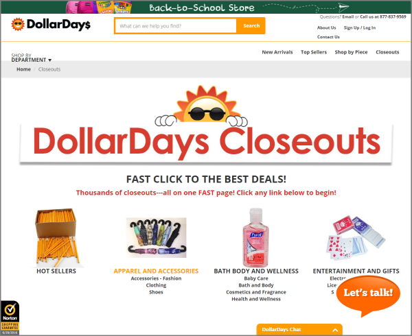
In every category, at essentially any time during the year, there are closeouts, he added. They’re desirable to customers because retail customers will use the word “Closeout” in their own ads after purchasing, conveying that same savings to their own customers.
Assortment “We've got basic goods that these stores need … that they can buy from us all the time, reorder all the time,” Joseph said.
From there, about a third of the goods area seasonal — for instance, currently the website is heavily promoting back-to-school items. From there, it transitions into Halloween, then Christmas.
“We've become a one-stop shop for all of these businesses to find the things they want to advertise, the things they need in their stores day in, day out, and also the things that the seasonal goods, which help give a different image of the store as the season moves on,” he said.
A minimum order of one caseIn dealing with traditional wholesalers and manufacturers, most have large minimum orders, Joseph said, either a dollar amount between $500 to $1,000 or a pallet, even a truckload of a product.
By offering a minimum order of one case, “it gives these small businesses a chance to really compete against the big guys down the street,” he said.

Click to see a larger, printable version of the chart
This way, he said, customers can order five different cases of five different items, and come back and buy more of whatever sells.
“If it doesn't sell, it's only one small case, they can mark it down. So it gives these small businesses a chance to kind of branch out and offer more of a product than they would through the traditional ways of getting supplies and products,” he said.
Open 24/7 What happens if you own a small business, he said, is, “your help doesn't show up, they’ve got goods rolling in the back end, you've got customers in your store, you don't have time to sit down and figure out, ‘What do I need to do to grow my business for the next month, for the next three months?’”
What ends up happening is, when those business owners finally come home, they have dinner, grab a cup of coffee and sit down in front of the computer to figure out the answer to that question.
With DollarDays, they can browse the website as they please, make orders and even chat with a representative if needed, whenever it fits into their schedule.
Sales and customer service “The fifth reason, the most important reason … is our sales and customer service. With our team here helping these people work through what they need, and helping the nonprofits know what they need also, it just gives us a chance to really relate to our customers,” Joseph said.
Last month, he added, 50% of business came from customers who have bought from DollarDays four or more times, “which is the backbone of our business. That's how a business survives and grows.”
They are also averaging over 40,000 new customers a month, and the new website’s focus on the customer, and customer service, allows them to balance all the new customers coming in with our existing customers.
Step #4. Integrate B2C customer-friendly practices
After redesigning the website, DollarDays also made a commitment to its blog and posting content relevant to its customers.

Click to see a larger, printable version of the chart
The blog is posted to every two or three days, with topics such as, “How Much Are Teachers Spending on Back-to-School Supplies?” and “Becoming an Online Merchant – Everything You Need to Know.”
“I wish I could figure out a way to let the whole world read these [blog posts] because these are relevant, at least to our customer base,” Joseph said.
He and his team decided to commit to the company blog because, “we know that if we engage our customers, then they're going to be thinking about us even when they don't need products. … We've got to figure out how a small company like ours can brand ourselves to be in sync with [our customers.]”
One way that DollarDays brands itself outside of blog content is to invest time in social media – it has profiles on Pinterest, Twitter and Facebook, with 248,000 followers on the latter. These platforms enable customers to understand “what we do outside of just selling products,” he said.
DollarDays has three different programs on the site that go after that kind of branding, which resonates with customers and helps to establish a community.
First, he said, because the company has become so embedded in the nonprofit world, “we are making a conscious effort to do all kinds of things to help the underprivileged and the companies that support them.”

Click to see a larger, printable version of the chart
Joseph believes the reason that so many people are following his B2B company on Facebook is that, “every month, we do something for the community. Like, for instance, if you go onto our Facebook page today … we are giving away $5,000 to teachers. So the winning teacher gets $2,000, the next one gets $1,000, and then there's another 15 teachers that get all kinds of things to be able to shop on our site,” he said.
The reason they are doing that is because this particular time period is focused on back-to-school products, and the company knows that “teachers spend at least $500 out of their own pocket to help the classrooms, whether it's to bring in food for the kids that are hungry, or to bring in supplies that the schools don't support,” he said.
Last month, he said, they gave away $5,000 to organizations that help support children. A month before that, another $5,000 was given away after having customers nominate their favorite small businesses in their area: “So we gave away a shopping spree of $5,000 to small businesses.”
Another program they have is focused on any nonprofit organization. DollarDays will set up a wish list for them for free, which the nonprofit can use to show people what they’re in specific need of.
“It doesn't cost anything, a special page for them. We let them pick 25 items that they really need for their organization. … Now, instead of somebody cleaning out their garage and bringing in stuff to their nonprofit, [the nonprofit] can pick out what they really need,” he said.
This program allows nonprofits to get what they need, when they need it, by the people they target.
A third program DollarDays has is that any one of its customers can donate 5% of their purchase to a nonprofit organization.
“For instance, if I spend $1,000 on DollarDays, there's $50 that we will let their favorite nonprofit spend on our site, obviously with no cost to the nonprofit. And so this is another thing that we do to help these nonprofits stretch their dollars,” he said.
Step #5. Make all page layouts responsive for mobile
The previous website was not mobile friendly, according to Joseph, but that became an element to address as more and more customers began accessing the site from their phones.
“We've made the site very responsive. … When you think about small businesses and who runs small businesses, the older generation now is retiring and turning it over to their kids and so forth,” he said.
As that younger generation begins taking over small businesses, or rise up in nonprofit organizations, mobile has become necessary, because “that’s just part of their life,” he said.

Click to see a larger, printable version of the chart
The team wanted to ensure that customers would be able to easily search or navigate the website — even the chat function — using their mobile phones.
“We realize that in order for us to stay on top of that we had to make our site on the phones very responsive,” he said.
RESULTS
“We have to act like a retailer even though we're a wholesaler because the customers have been trained. … So we, as a B2B, have to act like a B2C to get people to stay and not bounce, and to shop many, many pages. We just have to make it really easy, and so we just kind of drop all the barriers so that the journey is as frictionless as possible,” Joseph said.
The results DollarDays saw from this effort are:
- A 24% increase in account registrations
- A 12% increase in average order value
- An 81% decrease in people leaving the website after only viewing one page
- 4x faster page load times
Joseph also added that the website bounce rate for the month of June was 6.78%.
“We were able to get our bounce rate down from way up there to a 6-7% bounce rate, which tells us that even though we may have driven a lot of customers from Google organic or other ways, only 7% said, ‘I made a mistake. I'm out of here.’ The rest stayed,” he said.

Click to see a larger, printable version of the chart
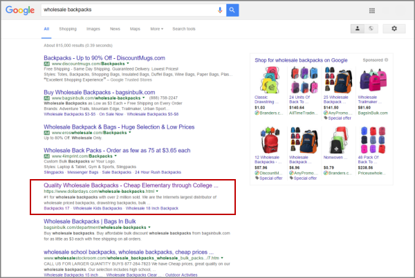
Another critical result of this effort has been on the website’s SEO. DollarDays is the #1 non-paid result on Google for many relevant terms, one of which is very useful with the current season — “wholesale backpacks.”
“There are a million places to find wholesale backpacks. You got one, two, three, you got four different companies paying PPC to be there. You can see that DollarDays is the number one place in the world to find backpacks, so that's how we get so much traffic onto our site,” he said. “Google thinks that we're relevant, which we are, to what customers are looking for.”
Creative Samples
- DollarDays page (top)
- DollarDays page (bottom)
- Registration form
- Closeout page
- Order size
- Company blog
- DollarDays Facebook giveaway
- Mobile page
- Wholesale backpack SEO
Sources
DollarDays International Resound — DollarDays’ branding and experience design vendor
Related Resources
B2B Marketing: Customer-focused site design for book ecommerce drives order volume up 211% in three yearsLanding Page Optimization: Which ninja turtle is your page?B2B Email Marketing: How a publishing company used marketing automation to increase CTR 1,112%Website Marketing: Complete website redesign increases conversion 470%SEO: How to launch a website redesign without hurting search rankings and trafficWebsite Marketing: Total site redesign increases traffic 308%

