|
SUMMARY:
With a fledgling weekly newsletter’s growth becoming stagnant, the team at HealthiNation decided to leverage existing content into a holiday ebook with recipe videos in order to engage new and current subscribers. |
by Courtney Eckerle, Senior Managing Editor
HealthiNation is an online health and wellness destination with video-only content. It has a mission, according to Jasmin Khan, Analyst, HealthiNation, “to empower people to live healthy and active lifestyles. We're the leading provider of original and engaging health video content.”
That video content covers a wide variety of health-related content, she added, from medical conditions, to getting better sleep, parenting, home workouts and healthy cooking videos.
“We try to reach people across generations at various ages and stages in their health and wellness journeys, and give them the tools that they need to achieve their health goals,” she said.
She estimated that people aged 35 to 54 is the main demographic, the majority of which is usually female.
“[Women] are particularly interested in healthy cooking and parenting, which are two of our big interest areas, as well as fitness and workout routines,” she said.
Sent every Tuesday morning, the weekly brand newsletter itself was fairly new, Khan said, not even a year old at the time when the company decided to launch a campaign giving away content.
“We noticed that the subscriber list for us had kind of begun to stagnate and we wanted to test out some different strategies,” she said.
According to Khan, the team began brainstorming different strategies that could be used to capture new email subscribers and encourage people to not only engage with content but do it in exchange for their information “so hopefully they could become returning engaged customers.”
They had noticed that the most popular content in newsletters was healthy cooking and recipe related, so they decided to capitalize on that subscriber interest to encourage people to engage with the campaign.
Most of the weekly newsletters have a theme, Khan said, which might be seasonal, based around a certain holiday or a health awareness month.
“For example, Cinco de Mayo was this week's newsletter, and we have a feature video, with a hero image at the top a larger image, and some copy [below],” she said.
During the time between Thanksgiving and New Year’s, the team decided to offer visitors a “holiday cookbook” in exchange for their email address.
“We wanted engaged and returning users, and we wanted to draw these customers back to our site to actually view the videos and keep returning each week and throughout the week, even on the days when we did not send out the newsletter,” she said.
The team had begun talking about some sort of giveaway as early as the holiday season 2014, according to Khan, with the idea of integrating an email capture into it. That idea came to fruition in October 2015.
“We wanted to do something just in time for the holidays when we were hoping there would be an increased interest around cooking healthy holiday recipes, and then also keep those users engaged into the new year for New Year's resolutions,” she said.
The team began planning the execution in October, and it was rolled out on November 10, 2015. The duration of the campaign was through January 4, 2016.
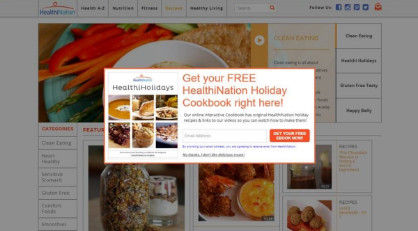
Part of that planning was to walk through the experience for the customer, which would begin with a visit to the HealthiNation site, where a lightbox would pop up.

Click to see a larger, printable version of the chart
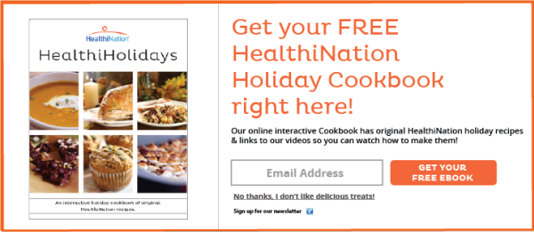
“We went through a few different [approaches] and played with the wording, but ultimately we decided on an image of the cookbook itself, so we could show people exactly what they were getting,” she said.
The team decided that the call-to-action wording would emphasize that it was a free holiday cookbook, reading: “Get your free ebook now!”
The user would enter their email address in order to follow the link to download the ebook, and below that was a box that indicated when checked that users agreed to receive emails from HealthiNation by entering.

Click to see a larger, printable version of the chart
The team also played with the wording of the call-to-action on the lightbox, which originally read, “Get Your Free Ebook Now.”
But they wanted to be more transparent about the fact that clicking on that button didn't necessarily lead to an instant download, but it would send the user an email with the PDF of the cookbook.
“We wanted to make sure we were as clear and transparent as possible for the user so they wouldn't be surprised or annoyed by all the stuff that they would have to go through. We wanted to make it a clear process to the final product,” she said.
Once someone had submitted their email and gone through that process, the lightbox wouldn’t pop up again for the same user, Khan said. However, if someone was already subscribed to the e-list, the system would allow them to download the cookbook.
Reaching out to the development team was a key piece of this campaign, to ensure that the lightbox appeared and functioned properly on the site, and people didn’t repeatedly get bombarded with the popup lightbox.
“It was actually very effective because … it didn't take a huge budget. We had it designed in-house, the lightbox and the cookbook. So that was all done by our HealthiNation team here. We're utilizing all our existing video assets, so it was a very efficient and effective campaign,” Khan said.
The team had to create the PDF of the cookbook itself, but all of the recipes already existed within HealthiNation’s content.
“It’s an interactive cookbook … and like a traditional cookbook, it includes the photographs and the written recipes, but it also includes links to our websites,” she said.
By linking to the website, the cookbook is able to continually drive people to the website to watch the recipe videos, and hopefully, continue on watching other content.

Click to see a larger, printable version of the chart
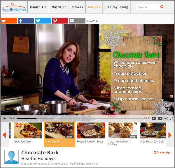
“It was linked to the actual cooking videos for each of the recipes that you can see our chefs making the recipe and watch exactly how it's done. So it was very interactive. It's very unique to our brand, since we are a video-only website. We were able to use our HealthiHolidays cooking series,” she said.
“We've played with the design a lot and wanted it to fit our brand, but also wanted it to be a product that looked professional and could be used and shared by our customers,” Khan said.
Each video linked to on the page has a bar at the top with different social media buttons, encouraging customers to “Share this!”
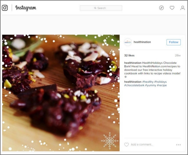
HealthiNation was also sharing it across its own social media platforms, encouraging followers to go to the website in order to download the ebook, and take advantage of specific recipes that were posted.

Click to see a larger, printable version of the chart
The ebook was also promoted on the brand’s “HealthiHolidays” Pinterest board, where the company posts recipes similar to what can be found in the downloadable ebook to followers on a regular basis.
The ebook cover was posted with the caption, “Introducing our 2015 HealthiHolidays eCookbook! Click here to receive your own copy today!”
“I think our biggest takeaway was that this strategy of reciprocity is a key component and will definitely be used by us going forward,” Khan said.
“By offering this giveaway in exchange for just an email address, we were able to engage with them in a different way than they normally would and give them something lasting. So the PDF they can save to their computer that they can keep and pull up again and keep returning to our website through the links provided there,” she said.
The results HealthiNation saw from this content giveaway campaign were:
Khan and her team are in the process of brainstorming another giveaway offer, after the success of the Holiday Cookbook giveaway.
“The great thing about these giveaways is that it's a really easy way to use the content we have but also to take into account what's trending at the moment or the seasonality or certain events or topics that are relevant,” she said, adding that her team is working on a “Guide to Summer” ebook.
“We're thinking about … doing it a little differently than the cookbook so we can have something new and exciting for our users, but maybe fitting in some of our lifestyle content along with our recipes. We hope it will be just as successful if not more and give us another great bump in our subscriber list,” she said.
HealthiNation
PostUp — HealthiNation’s email solutions vendor
Email Marketing 2015: The top 8 MarketingSherpa case studies for your email program next year
Content Marketing: How Copyblogger used content and a free paywall to grow its email list by 400%
Email Marketing: Copyblogger's email list grows by 400% using free paywall to access
Email Marketing: Weekly newsletter sees 400% lift in reactivation of inactive subscribers with personalization
Marketing Research Chart: Most effective email list building tactics
Get Better Business Results With a Skillfully Applied Customer-first Marketing Strategy

The customer-first approach of MarketingSherpa’s agency services can help you build the most effective strategy to serve customers and improve results, and then implement it across every customer touchpoint.
Get More Info >MECLABS AI

Get headlines, value prop, competitive analysis, and more.
Use the AI for FREE (for now) >Marketer Vs Machine

Marketer Vs Machine: We need to train the marketer to train the machine.
Watch Now >Live, Interactive Event

Join Flint McGlaughlin for Design Your Offer on May 22nd at 1 pm ET. You’ll learn proven strategies that drive real business results.
Get Your Scholarship >Free Marketing Course

Become a Marketer-Philosopher: Create and optimize high-converting webpages (with this free online marketing course)
See Course >Project and Ideas Pitch Template

A free template to help you win approval for your proposed projects and campaigns
Get the Template >Six Quick CTA checklists

These CTA checklists are specifically designed for your team — something practical to hold up against your CTAs to help the time-pressed marketer quickly consider the customer psychology of your “asks” and how you can improve them.
Get the Checklists >Infographic: How to Create a Model of Your Customer’s Mind

You need a repeatable methodology focused on building your organization’s customer wisdom throughout your campaigns and websites. This infographic can get you started.
Get the Infographic >Infographic: 21 Psychological Elements that Power Effective Web Design

To build an effective page from scratch, you need to begin with the psychology of your customer. This infographic can get you started.
Get the Infographic >Receive the latest case studies and data on email, lead gen, and social media along with MarketingSherpa updates and promotions.