|
SUMMARY:
As the eyes are the window to the soul, the website is the window to the value proposition. The site doesn’t create the value prop, but it helps the world understand the value of your product. Such was the case for entrepreneur Steven Diebold. His passion for his product radiated through the phone when we talked. But his original website just wasn’t conveying it. Read on to see the before and after, learn the reason behind the changes and discover the transformative impact of not just an optimized site, but other benefits from using a rigorous process to get there (like better ROI from other channels). |
THE CUSTOMER
Papa Steve’s No Junk Raw Protein Bars are all natural, handmade, locally sourced, and a lot of the ingredients are organic. “Everything is all manual, so we can only make so many in a given week because we make them every Tuesday, and then we ship them every Wednesday and Thursday,” said CEO/Founder Steven Diebold.
The company is based in Culver City, California, and many of its customers purchase from area Whole Foods Market, Gold’s Gym, Albertsons and other local retailers.
But, thanks to the power of the internet, Diebold also has customers throughout the U.S. and Canada. He launched the company’s website in 2011, and since then has sold to a wide range of customers interested in fresh, wholesome food made without preservatives — from runners to diabetics to stay-at-home moms.
CHALLENGE
Although the site was working and converting, Diebold knew he was leaving money on the table because the website wasn’t communicating his products’ unique value proposition well. He also knew the website wasn’t effectively sequencing communication to the customer, and that the customer order experience was poor.
Because he was making money from the site, he was concerned that if he did something wrong in the redesign, he could inadvertently decrease conversion. He wasn’t sure what changes to make, partly because he couldn’t make sense of the data. “Analysis is what I really needed. I wasn't able to really understand what was happening on the site through Google Analytics or through just looking at all the data. I wasn't able to understand it in a simple way.”
Diebold was also facing rising costs from selling through Amazon, so selling through his own website became even more important to him. “Cost of sales was excruciating,” he said. It skyrocketed from 20% to 70% through Amazon over the course of three months.
PROJECT
Diebold hired MECLABS Institute (parent research organization of MarketingSherpa) to redesign his website and help him decipher his data.
STEP #1: Analyze the data
The MECLABS team started by using the MECLABS Discovery Triad hypothesis-driven approach to get a better understanding of what was happening on the site.
Diebold didn’t have a good sense of where his traffic was coming from and how it was performing. The team discovered that, for example, 10% of traffic was coming from Pinterest. It also discovered that traffic coming from Google Product Listing Ads (PLA) underperformed organic and direct traffic. This indicated an opportunity to improve the value exchange on the product pages to increase the conversion rate.
The team also sought to discover where in the funnel Papa Steve’s was leaking revenue. One example discovery was a tracking issue that caused the clickthrough rate (CTR) for the final steps to be overinflated, likely caused by PayPal users and/or return users who skip some steps.
The team used the Forensic Data Analysis in two ways — to build an ROI channel model and to inform the website redesign strategy.
STEP #2: Build an ROI channel model
To help Diebold decide where to invest, the team used the Forensic Data Analysis to build an ROI channel model. Even though it didn’t work exactly as intended, it helped Diebold reduce costs significantly.
The ROI channel model was based on a set of assumptions to build a hypothesis. By rolling out the model, Diebold learned that those assumptions were in fact false. But by having the model to work with, he was able to pivot in another direction based on the new knowledge he gained.
“The hypothesis that we drew from the ROI model proved to be incorrect, but it didn't matter because it gave me some data to work with, it helped me look at the problem and kind of see, hmmm, something's not right there. The hypothesis isn't working as we thought it would, so what can I do to adjust it?” Diebold said.
The model helped him conduct a bidding analysis of all the keywords he was buying for Amazon ads. He discovered he was buying expensive keywords that were driving clicks but not sales, and ultimately changed his keyword mix.
He was able to cut his monthly Amazon ad spend 82% and yet achieve the same amount of sales.
“That's always how I run things — with experiments. Just because one hypothesis doesn't work out, it doesn't mean anything. It's just data. It's just learning,” he said. “So it’s very valuable. It gave me a good data set to understand so I could form my own hypothesis because I've been doing this for a while and understand some caveats that I could test and try. And I did, and my cost of sales from Amazon went from 70% to 17%.”
STEP #3: Discover and communicate a unique value proposition
The data analysis also informed a Conversion Index Analysis on the Papa Steve’s website, a process which identified many areas that presented an opportunity for optimization.
One of the biggest areas of opportunity was the expression of the value proposition — there was no differentiation messaging clearly explaining why this bar is superior to other bars.
For example, it was hard to understand the ingredients from a differentiation standpoint on the homepage. A dedicated ingredients page had some good information, but it was not being seen by most visitors and could be improved and leveraged on the homepage.
“What made the product special was a little bit buried,” Diebold said.
Creative Sample #1: Original Papa Steve’s homepage

In addition, taste was a key differentiator compared to competitors, but there was little messaging about it.
On the redesigned, optimized website, the team sought to better articulate differentiated value.
The new homepage communicated the superior ingredients in a clear headline that greeted visitors. “ALL NATURAL, NO JUNK, NON-GMO RAW PROTEIN BARS”
And the subhead communicated the taste — “That Actually Taste Good!”
Creative Sample #2: Top of optimized Papa Steve’s homepage

Even though Diebold has worked on this product for seven years, the exercise to identify and message differentiated value helped him discover new opportunities. For example, the Our Story page includes the line, “I wondered how mass manufactured food could be fresh when it had to be stored in warehouses all over the USA for months at a time,” which sparked a new way to discuss his company’s value proposition that he never thought of before.
“They're [competitors are] selling food like they're selling iPads, and I didn't really think about that until I saw some of the messaging that we put in about no warehouses. And I thought, I never mentioned that about no warehouses before. I hadn't thought about that.”
STEP #4: Structure the layout to help visitors absorb the product’s value and benefits
In addition to a lack of value wording, the Conversion Index Analysis hypothesized that the layout, structure, and sequencing of communication on the website overwhelmed and confused visitors, causing friction and anxiety.
The homepage layout was confusing; it was hard to tell where to look or how to read it. For example, the credibility seals all looked the same, creating difficulty consuming the information.
Creative Sample #3: Credibility seals on the original website

On the redesigned homepage, credibility seals were structured and sequenced to help tell the product’s story in a compelling fashion.
Creative Sample #4: Credibility seals on the optimized website

In another example, the product had good current reviews by Yotpo, but they were way out of the eye path, which didn’t draw attention to reading them. They appeared further down the page, but with the amount of descriptive text on the overall homepage, it’s not likely that many visitors ever reached them. The optimized homepage clearly called out the reviews in the middle of the page.
In addition to written reviews, the website also had YouTube video testimonials to alleviate anxiety. While the content in the videos was helpful, it was unclear who exactly the persons were and why they were credible sources.
Creative Sample #5: Original testimonial video on the site

In the optimized website, the team added a line of copy explaining who the testimonial was from, boosting credibility: “Hear from a AFPA Certified Personal Trainer & Nutritional Consultant.”
Creative Sample #6: Optimized display of communication video

Since the recording of the video was low quality, the team moved it farther down the page. Originally, it was in prime real estate above the fold, providing a key impression of the company to first-time visitors. The team moved it down the page to just be a supporting element, reducing anxiety.
The quality of the overall website design was hypothesized to be an element that might cause anxiety since the website felt outdated. But Diebold was cautious about this aspect of the redesign. “I didn't want to make it look too slick,” he said. “I knew it looked crappy before, but it had that small business, kind of homegrown feel to it.”
So the team was careful not to go too far with the redesign. “I think they kept the design in the middle. Cleaning it up, making better graphics, making it look more clean and professional. I think it improved the trust, but I don’t think it lost the appeal of you’re still supporting a small business,” he said.
Creative Sample #7: Full, redesigned homepage

STEP #5: Optimize the website for mobile as well
The Forensic Data Analysis uncovered that the majority of traffic (58%) was coming from mobile, but mobile accounted for less than a third of orders because the mobile site’s conversion rate was 3.5 times worse than desktop. This was due to the friction created by a poor mobile experience.
This wasn’t necessarily a surprise to Diebold since the site was not optimized for mobile and difficult to navigate, but he wasn’t sure what value hierarchy, structure and sequencing to display on a mobile site if he did redesign it and optimize it for mobile.
“If I wasn't sure how to communicate that value in the 22- to 27-inch environment on a desktop, I was definitely going to have a challenge doing that on a four-inch device,” Diebold said.
Creative Sample #8: Papa Steve’s original mobile website

The new mobile site reduces friction now that it is optimized for mobile devices. While it is similar to the desktop site, some of the sequencing is different. For example, to make ordering quick and easy for mobile visitors, the “Shop All Bars” button is above supporting value statements about being GMO free, containing only the highest quality organic ingredients, etc. On the desktop site, it is below those statements.
Creative Sample #9: New Papa Steve’s mobile website — before-the-scroll on iPhone X

Creative Sample #10: Full, new Papa Steve’s mobile homepage

RESULTS
“You can always find a new traffic source, but the sequencing of the story on your website is really critical. If you get that right, you can give people a better experience, and your sales are going to be better, and the business is going to benefit because the customer feels they're benefiting. And if you're truly providing value to customers and they feel that they're getting value, they’re going to keep doing business with you,” Diebold said.
Since the redesign was launched just a few months ago, the overall conversion rate (total orders/total visitors) is up 18%, and overall revenue increased 18% as well.
“And that’s a lot because the conversion rate was pretty high before,” Diebold said.
Asked what advice he would give to other entrepreneurs, Diebold said, “If you don't have a good product, it doesn't matter what you do. But if you have a great product, then make sure people know it's a great product. Then I think you're doing a service for both the customer and the business because both are getting the benefit. The customer gets a great product, and the business is getting to make a sale — and neither loses.”
Key Partners
Diebold expressed appreciation for a few partners that were key to the website redesign’s success:
Related Resources
Marketing Leadership: Aligning The Entire Team Around The Unifying Vision Is An Integral Part Of Project Management — Website development is a complex project, and you need the right approach. This article gives ideas for managing projects.
How Whirlpool Raised Customer Loyalty by 68% by Revamping its Site Using Persona-Based Design —Website development is a topic MarketingSherpa has covered for almost 20 years. Here is a case study with Whirlpool from 2005.
Landing Page Optimization: How Aetna’s HealthSpire startup generated 638% more leads for its call center — A key element of website development is having the right messaging on the website. Here’s an example of how experimentation can help with that, and why the results are sometimes counterintuitive.
Customer-First Marketing: How The Global Leadership Summit grew attendance by 16% to 400,000 — Getting the value proposition right is core to website development as well. Here’s an example of how Global Leadership Summit did that and the results of its efforts.
Get Better Business Results With a Skillfully Applied Customer-first Marketing Strategy

The customer-first approach of MarketingSherpa’s agency services can help you build the most effective strategy to serve customers and improve results, and then implement it across every customer touchpoint.
Get More Info >MECLABS AI

Get headlines, value prop, competitive analysis, and more.
Use the AI for FREE (for now) >Marketer Vs Machine

Marketer Vs Machine: We need to train the marketer to train the machine.
Watch Now >Live, Interactive Event

Join Flint McGlaughlin for Design Your Offer on May 22nd at 1 pm ET. You’ll learn proven strategies that drive real business results.
Get Your Scholarship >Free Marketing Course

Become a Marketer-Philosopher: Create and optimize high-converting webpages (with this free online marketing course)
See Course >Project and Ideas Pitch Template

A free template to help you win approval for your proposed projects and campaigns
Get the Template >Six Quick CTA checklists

These CTA checklists are specifically designed for your team — something practical to hold up against your CTAs to help the time-pressed marketer quickly consider the customer psychology of your “asks” and how you can improve them.
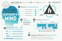
Get the Checklists >Infographic: How to Create a Model of Your Customer’s Mind

You need a repeatable methodology focused on building your organization’s customer wisdom throughout your campaigns and websites. This infographic can get you started.
Get the Infographic >Infographic: 21 Psychological Elements that Power Effective Web Design

To build an effective page from scratch, you need to begin with the psychology of your customer. This infographic can get you started.
Get the Infographic >Receive the latest case studies and data on email, lead gen, and social media along with MarketingSherpa updates and promotions.