
|
SUMMARY:
“Many vendors and customers have mentioned seeing Comfort Union’s trucks on the streets. Yet, it only has one truck that is currently wrapped.” I love that anecdote from this article because it shows the outsize impact of creative strategy for a small brand. If you’re struggling to compete with the big brands, I hope you get some ideas from this article. They might have the big branding bucks, but remember, no one can be more creative and more nimble than the small business entrepreneur. Read on to get ideas from a tech recruiter training company and an HVAC contractor. |
Try this prompt using the Conversion Pro expert assistant in MECLABS AI –– it's totally FREE to use, for now (MECLABS is MarketingSherpa’s parent organization):
Could you please scan the content on this page and suggest improvements? [paste webpage URL here]
Strategic branding for small businesses is extremely difficult. Here’s a behind-the-scenes look at the evolution of branding for an HVAC, plumbing, and electrical contractor in Calgary.
Comfort Union’s visual branding – predominantly generic red and blue, colors traditionally associated with the heating and plumbing industry – failed to distinguish it from competitors. This lack of differentiation made it difficult to communicate its unique value proposition and to stand out in a crowded market.
Creative Sample #1: Old ad on local classified website

The contractor struggled to attract the right clients; most were primarily interested in the lowest price rather than the quality of service or its expertise.
“Without a strong, distinctive brand, we could not effectively showcase our advantages or justify our value beyond competitive pricing,” said Asif Bux, Business Development and Service Manager, Comfort Union. “It hit me when I saw the stark difference between how people viewed us from our ads versus their experience talking to us or meeting us. Our brand wasn't successfully conveying our core value of delivering exceptional comfort.”
The team spent nearly a year creating new branding and a new web presence. They first did some background research to better understand current performance and customer preferences. “I studied the data on tools like Hotjar to see how customers were interacting, Google Analytics, and general surveys,” Bux said. Brainstorming sessions, market research, and iterations of design involved key players like a marketing agency, graphic designers, and, importantly, the Bux family that owns the business.
Finding the right balance in the visual elements to avoid being either too playful or overly serious was a challenge. They noticed that most HVAC companies fell into one of these categories. Given that their name, ‘Union,’ already suggested a level of seriousness, they aimed to complement this with warmer elements that did not compromise their professional image.
Choosing the appropriate mascot and color palette to convey both comfort and trust required experimenting with various concepts until they discovered the ideal combination that reflected their values and resonated with their target audience.
Here are some mockups the team put together during this process.
Creative Sample #2: Branding mockups for contractor

In terms of the mascot, they deliberated over whether it should have a retro, nostalgic, or playful appearance.
Ultimately, they wanted something that would evoke happiness upon seeing the brand, without turning it into a joke. Decisions regarding the mascot's size relative to the logo, the font style, the texturing, and other minor details were considered to ensure each element aligned with their branding's overall message and objectives.
Here is their final logo.
Creative Sample #3: Contractor’s truck with new logo

The new logo played up the narrative of a father and son that run a family company and tied into the local community as well. “The inspiration for our branding came from my upbringing in the bear country of Alberta and drawing on the strength and guidance I received from my father. This inspired our bear mascot, symbolizing both our father-son story and the traits of coziness and comfort we aim to deliver,” he said.
They opted against a full-body mascot to avoid introducing distractions. The father and son holding a wrench together is meant to convey the concept of a father teaching his son the value of tools and great service. “My father has been a significant influence on me; his teachings and aspirations have shaped my business and technical skills,” Bux said.
The team created a tagline – ‘There’s Comfort in Togetherness’ – and tied it into the story of the father-son story.
Creative Sample #4: ‘Our History’ page on contractor’s redesigned website

That story is core to the rebranding. The team could have chosen to address specific customer anxieties by changing the name to Trust Comfort or Anytime Heating & Plumbing or Trust Heating & Plumbing.
“I didn't want our company to focus solely on addressing one specific problem or various issues. That's why I steered clear of anything in our name or branding that leaned heavily on notions of addressing trust and the like. Instead, my primary objective was a brand that reflected my unique story and values. So, from the beginning, I sought a name that captured my unique journey and the inspiration I drew from my father. Changing or influencing people's perceptions became a secondary goal. My primary focus was on telling my story, which made choosing a name relatively straightforward,” he said.
“Interactions with our Google Maps listing have skyrocketed by 284%, increasing our visibility and accessibility to local customers,” Bux said.
The HVAC contractor has been able to succeed on an ad spend that is less than 1% of sales. The rebranding and website redesign has helped drive the following results:
The team feels that the new brand gives the small business an outsize presence. Employees are frequently asked if the company is a franchise, which shows the perceived maturity and professionalism of the brand, despite it being only one year old. Many vendors and customers have mentioned seeing Comfort Union’s trucks on the streets. Yet, it only has one truck that is currently wrapped.
Moreover, there has been a shift in pricing discussions; negotiations over quotes have become rare. Previously, employees often faced comments about being too expensive on every other job. Now, such remarks are uncommon, even though the pricing has remained the same. This change underscores a common expectation that non-branded companies are supposed to be the cheaper option, an assumption they've successfully moved away from with the new brand.
“I wish I had understood the value of branding earlier in my entrepreneurial journey. Branding is not an easy task and takes months to get right. It starts with a name that reflects your aspirations and unique story. In the end, everything must tie together cohesively. To create disruptive branding, you must pay attention to every minor detail,” he advised.
For Q1 2025, the main goal is to increase the website’s conversion rate. While the rebranding helped improve an extremely low conversion rate (“we saw a lot of lead forms going unanswered”), there is still room to improve.
“There was a misstep with our current website. Despite its appealing and impressive design, it lacks in conversion rate. During our branding process, we ensured the site's design aligned with our overall brand identity but missed a critical point: cohesive branding is important, but the primary goal of a website is to engage users and facilitate conversions,” he said.
While emailing with Bux to write this case study, his email signature caught my eye. It started like you would expect, ‘As the owner of Comfort Union, I am committed to your utmost satisfaction.’
But the second line surprised me, ‘It is my responsibility to approach every project with genuine curiosity and enthusiasm, understanding your unique HVAC, plumbing and electrical requirements.’
I don’t have any special professional experience in this industry. But I am a homeowner, so I have dealt with my share of contractors. Plenty of them talk about ‘satisfaction,’ but I have never seen a contractor mention ‘genuine curiosity and enthusiasm.’
Techmap offers certification courses for technical recruiters. The team tried a radically different approach to its ads to stand out among the thousands of organic and paid messages its ideal customers gets on LinkedIn.
“It wasn't only about increasing the conversion rate. More people talk about you, share your post with friends and colleagues. So for the top of the funnel, it also helped us create good brand awareness,” said Ruben Kostucki, CEO, Techmap.
The team was using LinkedIn Ads to acquire leads. They ran ads with a vector illustration and a basic headline, as well as ads with testimonials.
Creative Sample #5: Previous LinkedIn ad

The team decided to test using visual, funny ads and memes to convey their key messages, based on their research of target audience (tech recruiter) pain points.
Creative Sample #6: New LinkedIn ad

“Self-deprecating humor can work great if done correctly. In this ad [see Creative Sample #7] we simply take an aspect stereotypical of the target audience (being fooled by a candidate during an interview) and make light of it. ‘It's funny because it's true!’ This type of humor is a fantastic way to relate to the audience,” said Kamel Ben Yacoub, CEO, Getuplead (Techmap’s agency).
Creative Sample #7: Another new LinkedIn ad

The team tested the memes and funny ads versus ‘standard’ ads for two months.
“Demo conversion rate increased by 159% scheduled from LinkedIn ad leads,” Yacoub said. And there was a 175% increase in LinkedIn ad CTR (click-through rate), from 0.4% to 1.5%.
“Humor works but it's very country/culture specific. An ad that worked super well in North America didn't perform well in Europe, and vice versa,” Kostucki said.
“You also never really know what is going to work. What you need is a trial-and-error mentality with a rigorous scientific approach of testing and finding ways to make it work,” he advised. “If your ad can make a point about your product's pain, even better. Fun for the sake of fun is not as powerful as fun that pokes the pain.”
This article was distributed through the MarketingSherpa email newsletter.
Creative AI Marketing: Escaping the ‘Vending Machine Mentality’
Local Marketing: 3 strategies that worked for small businesses with physical locations
Get Better Business Results With a Skillfully Applied Customer-first Marketing Strategy

The customer-first approach of MarketingSherpa’s agency services can help you build the most effective strategy to serve customers and improve results, and then implement it across every customer touchpoint.
Get More Info >MECLABS AI

Get headlines, value prop, competitive analysis, and more.
Use the AI for FREE (for now) >Marketer Vs Machine

Marketer Vs Machine: We need to train the marketer to train the machine.
Watch Now >Live, Interactive Event

Join Flint McGlaughlin for Design Your Offer on May 22nd at 1 pm ET. You’ll learn proven strategies that drive real business results.
Get Your Scholarship >Free Marketing Course

Become a Marketer-Philosopher: Create and optimize high-converting webpages (with this free online marketing course)
See Course >Project and Ideas Pitch Template

A free template to help you win approval for your proposed projects and campaigns
Get the Template >Six Quick CTA checklists

These CTA checklists are specifically designed for your team — something practical to hold up against your CTAs to help the time-pressed marketer quickly consider the customer psychology of your “asks” and how you can improve them.
Get the Checklists >Infographic: How to Create a Model of Your Customer’s Mind
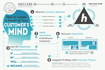
You need a repeatable methodology focused on building your organization’s customer wisdom throughout your campaigns and websites. This infographic can get you started.
Get the Infographic >Infographic: 21 Psychological Elements that Power Effective Web Design
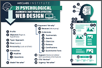
To build an effective page from scratch, you need to begin with the psychology of your customer. This infographic can get you started.
Get the Infographic >Receive the latest case studies and data on email, lead gen, and social media along with MarketingSherpa updates and promotions.