|
SUMMARY:
Your checkout flow. The categories on your blog. The template for your website. As you’ll read in this article, the marketers that don’t take these website elements for granted, that strive to find the best way to execute these elements of their website, can garner significant results. Read on for examples from software, auto parts, and apparel companies. |

This article was originally published in the MarketingSherpa email newsletter.
Steel Seal was looking to revamp its website and hired MECLABS Institute to re-envision the web design. The team identified the website’s checkout flow as an area of opportunity. The total checkout flow contained six steps.
Creative Sample #1: Checkout flow for original (control) automotive parts website

After evaluating what information was necessary to both communicate to and collect from the customer, the team was able to condense the checkout flow into only two steps in a redesigned version of the website.
Creative Sample #2: Checkout flow for new (treatment) automotive parts website

The team set up an experiment to determine which website and checkout flow would be more effective. The treatment – the two-step flow – generated a 54% relative increase in conversion.
You can learn more about this experiment, and see other web design experiments, in The End of Web Design: Don’t design for the web, design for the mind from MarketingExperiments (MarketingSherpa’s sister publication).
The team at Wistia redesigned the video-software company’s blog homepage.
The team wanted to simplify the design and make it easier for visitors to navigate through and find new content. They also wanted to provide a more curated content experience with room to promote content they hand-selected versus just having a feed of recent posts. Finally, they wanted to shine more of a light on video content to keep visitors engaged with different mediums.
Creative Sample #3: Original blog homepage for software company

To accomplish these goals, the category tags were moved to the top of the page, allowing visitors to easily navigate to a specific content category.
Creative Sample #4: Category tags on new blog homepage for software company

A dedicated “Editor’s picks” was added to the carousel with content that frequently changes based on what’s trending.
Creative Sample #5: “Editor’s picks” on new blog homepage for software company

A dedicated video area was added to highlight and showcase video content; video posts are indicated with a video icon and the video is previewed in the thumbnail with a mouse hover.
Creative Sample #6: Top videos section on blog homepage for software company

Creative Sample #7: Full new blog homepage for software company

Prioritizing the category tags increased traffic to those pages. The marketing (23% increase in traffic), Wistia culture (22% increase), and production (17% increase) categories have experienced the greatest lift.
Additionally, the team noticed a lift in both traffic to featured posts and views for featured videos when evaluating the data for one month before and one month after the new blog homepage’s fall launch. The percentages varied per post, ranging from a 2% lift to a 256% lift:
“My advice to other marketers is to clearly identify your goals in advance and work collaboratively with other experts on your team to reach those objectives. Talking through what we really wanted to accomplish through a refresh helped guide the design team on the decisions they made with specific design elements. Working collaboratively ultimately resulted in a much better end product than if one team or the other took the lead,” said Meisha Bochicchio, Content Marketing Manager, Wistia.
The previous website design for Black n Bianco was created with a generic pre-made template. “It lacked relevance to our brand. We wanted to create a design that would showcase our brand personality and style,” said Lisa Chu, Business Owner, Black n Bianco.
The templated design had a completely different layout structure when viewed on tablets and smartphones.
Creative Sample #8: Previous website design for apparel company

The team wanted to move away from the generic template and create a website design that matched the apparel company’s products. Everything on the website was completely overhauled – the fonts, layouts, colors, banners and product detail pages. “We chose a modern approach to our fonts and banner styles. It's clean, simple and easy to view with a hint of playfulness that represents our brand,” Chu said.
They also created an eye-catching section dedicated to the brand’s Instagram posts. New customers could easily view the brand’s social media posts while satisfied customers could share their experience.
In addition, the website structure was changed so it would have a seamless transition from desktop to tablets and smartphones.
Creative Sample #9: New website design for apparel company

“Researching my industry allowed me to spot a pattern. All successful websites shared a common trait. They all had an original style that represented their brand. They may share similar layouts but the colors, fonts, banners and designs were consistent with their products and brand,” Chu said.
After launching the website redesign, the team gathered data for a few months. “Comparing our sales data and customer engagement we saw a pretty huge spike. Customers were not only looking at more pages, but they were buying more products,” Chu said.
Average order value increased from $55 to $68 and conversion rate increased from 2.8% on average to 3.2%.
“Every industry is unique so research will be essential to create a website design that is effective and relevant,” Chu advised.
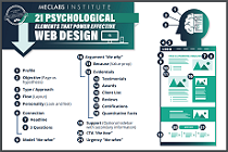
The 21 Psychological Elements that Power Effective Web Design infographic
Web Design: 4 mini marketing case studies about design changes big and small
Get Better Business Results With a Skillfully Applied Customer-first Marketing Strategy

The customer-first approach of MarketingSherpa’s agency services can help you build the most effective strategy to serve customers and improve results, and then implement it across every customer touchpoint.
Get More Info >MECLABS AI

Get headlines, value prop, competitive analysis, and more.
Use the AI for FREE (for now) >Marketer Vs Machine

Marketer Vs Machine: We need to train the marketer to train the machine.
Watch Now >Live, Interactive Event

Join Flint McGlaughlin for Design Your Offer on May 22nd at 1 pm ET. You’ll learn proven strategies that drive real business results.
Get Your Scholarship >Free Marketing Course

Become a Marketer-Philosopher: Create and optimize high-converting webpages (with this free online marketing course)
See Course >Project and Ideas Pitch Template

A free template to help you win approval for your proposed projects and campaigns
Get the Template >Six Quick CTA checklists

These CTA checklists are specifically designed for your team — something practical to hold up against your CTAs to help the time-pressed marketer quickly consider the customer psychology of your “asks” and how you can improve them.
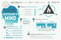
Get the Checklists >Infographic: How to Create a Model of Your Customer’s Mind

You need a repeatable methodology focused on building your organization’s customer wisdom throughout your campaigns and websites. This infographic can get you started.
Get the Infographic >Infographic: 21 Psychological Elements that Power Effective Web Design

To build an effective page from scratch, you need to begin with the psychology of your customer. This infographic can get you started.
Get the Infographic >Receive the latest case studies and data on email, lead gen, and social media along with MarketingSherpa updates and promotions.