Legitimate emailers are getting newsletters sent to junk bins for a variety of reasons. Why? 56% of consumers consider email newsletters that “just aren’t interesting to me” as “spam” -- even if they know the sender, according to data from MarketingSherpa’s Email Marketing Benchmark Guide 2008.
That’s why we’re excited to present exclusive new research on newsletter design from NextStage Evolution, which just wrapped up an 18-month study on more than 1,400 newsletter marketers. The full report will be available next week.
Heatmaps and eyetracking tests are good at showing what recipients look at, but Joseph Carrabis, Founder & Chief Research Officer, and his team wanted to take a cerebral approach. In a nutshell, they wanted to discover what influences the mind and generates a positive response. “How can I design something so the recipients will react the way I want them to?” Carrabis asks. “That’s the key.”
After reviewing their initial findings, Carrabis and his team examined the performance of numerous design styles. Check out the key findings, which can help you better understand how to increase engagement and response from your readers.
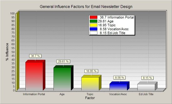
Chart #1. Top Factors to Get Subscriber Attention Copyright 2008 NextStage Evolution LLC
What gets a subscriber’s attention most? What produces opens, clicks, forwards and conversions? According to NextStage Evolution’s findings, the five leading factors are:
1. Information Portal
2. Age
3. Topic
4. Vocation/Avocation
5. Education/Job Title
The Information Portal -- where people read your messages -- has the biggest impact (36.7%) on whether they take the action you desire.
This chart underscores a key idea that recent EmailSherpa articles have highlighted: Surveying your list to see what type of device readers use to view your email is definitely worth a shot. That’s right: viewing on an iPhone, a BlackBerry, a Mac or a PC affects how they will be influenced by your message more than any other factor. Being able to segment your list according to receiving device could be a boon to your response rates.
“To be honest, I kind of expected age to be the winning category for this chart,” Carrabis says. “But this clearly demonstrates how important the information portal can be.”
Still, age -- the recipient’s age not their time on the list -- continues to rank as a key factor. Teen and young adult clothiers like Karmaloop typically see superb open rates, as do newsletters targeting a distinctly older demo like those by AARP.
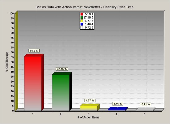
Chart #2. Number of Action Items to Include in an Email Copyright 2008 NextStage Evolution LLC
Without question, fewer action items bring better results. One-action emails received 55.9% clickthroughs, soundly beating two-action emails, while newsletters with three, four or five action items were all under 5%.
This confirms numerous MarketingSherpa studies in landing page design that have pointed to the power of focusing an email or Web page around a single action to avoid confusion. Segmentation and personalization are keys to taking advantage of this principal in email.
Another tip from Carrabis: How many hotlinks should you use in newsletters: “The best rule for all is to select 1, 3, 5, 7 or 9, never an even value -- never 2, 4, 6 or 8 -- and rarely more than 9.”
One of the goals of the study was to test optimal newsletters designs. To that end, Carrabis and his team created six email templates based on the prior findings of the study.
In the following charts, we’ll look at the performance of two templates to come out of the study -- given the code names M1 and M3. We’ll start with M3, the most successful design in the study.
Here’s what the M3 looks like, stacked vertically, from top-to-bottom:
o Horizontal identifier logo at the top
o Followed by chatty greeting (e.g., "Hello,
!")
o Then, a small text of image link
o Followed by a paragraph of text
o Finally, an elaborate headline-like link
Below, we see the capture rate of the M3 design across different types of newsletter, from sales blasts to more information heavy examples, and demographically targeted. The TouchPoint type refers to emails that are meant to keep the brand in front of readers, rather than generate direct sales.
Chart #3. How Simple Design + Personalization Works on Various Newsletters

Copyright 2008 NextStage Evolution LLC
Interestingly, with this design, targeting age and cultural demographics slightly outperforms the other categories. “If you have content that you know is specific to baby boomers, Hispanic-Americans, Asia-Americans, African-Americans, etc., use the M3 form. It will win every time,” Carrabis says.
Another takeaway, according to Carrabis, is that if you want a newsletter to spread virally inside social networks, use the M3.
“This was a classic case of researching spaghetti but also discovering how watermelons grow. The reason why Age and Culture and even TouchPoint did so similarly is because they both use the social cognition part of the brain. Once you think of it that way, it makes sense.”
As Carrabis briefly alludes to, the “TouchPoint” category edged out “Info w/Action Items” for second best.
The next chart takes a look at how another design variation, the M1, performed across the same types of email. The M1 is made up of the following elements, from top-to-bottom:
o A horizontal identifier logo
o Followed by a very short menu-like list of action items
o Then more elaborate links next
o Content without action items at the bottom
Chart #4. How More Links & Action Items Work in Various Newsletters

Copyright 2008 NextStage Evolution LLC
The performances of the General Industry Info and Info w/Action Items suggest the following: M1, with an array of links or action items to click through, appears to work well for newsletters that supply free content (possibly along with a purchasable offer, especially for the latter category).
This actually flies in the face of the earlier point that two or simply “fewer” action items work best. What’s important to remember here is that some publishers who hotlink the heck out of their messages get better results, while others with “cleaner” designs do extremely well, too. Once again, it proves that knowing your audience and testing specific ideas -- like how many hotlinks and action items -- is a smart way to go.
Finally, Carrabis and his team wanted to analyze an email’s effectiveness according to how long it takes a subscriber to respond to an action items in a newsletter. Not surprisingly, the shorter the interval between the send and the click, the better and more relevant the message was. (The lower the number, the more favorable the result.)
Chart #5. Time-to-Act Values

Copyright 2008 NextStage Evolution LLC
The chart above shows how the two email styles we detailed performed in generating a rapid reaction time.
- Again, the M1 included a horizontal identifier logo, very short menu-like list of action items, more elaborate links and content without action items at the bottom.
- The M3 included a horizontal identifier logo at the top, chatty greeting (e.g., "Hello, !"), small text of image link, paragraph of text and an elaborate headline-like link.
The biggest differences were in TouchPoint and Age/Culture/Demographic email newsletters, where the time duration is incredibly longer. It’s possible that the greater number of action items and links to choose from caused part of the lag.
Meanwhile, the stellar performance in the Age/Culture/Demographic category reinforces the importance of connecting with your segments.
Useful links and notes related to this article
Past Sherpa article - MailerMailer’s research findings on industry-wide opens and clickthroughs:
http://www.marketingsherpa.com/article.html?ident=30169
The full report "Designing An Email Newsletter For Maximum ROI" will be available at:
http://www.nextstagevolution.com/


