|
SUMMARY:
A landing page conversion is a completed next step (demo request, signup, download, etc.) from a targeted visitor segment. A landing page converts better when you pick one audience and one next step, then state the value in plain words, back it with proof, and make the action easy and low risk. Read on to see, step by step, how to turn a nice page into a page that gets more people to take the next action. |
Action Box: The New Economics (and Philosophy) of Value in the AI Era
Learn how businesses can describe and price their value in the AI era. Join us for a free AI Guild session on Wednesday, September 2nd, at 10 am EDT. Register now. (from MECLABS AI, MarketingSherpa’s parent company).
The goal of a landing page is a conversion.
But have you ever stopped to think what a conversion actually is? As marketers, sometimes we just think it’s a metric we need to hit this quarter.
A conversion is the act or process of changing something or someone from one form, use, or state into another.
The ultimate conversion for a marketer is changing someone from non-customer to customer. But for many products there are many smaller conversions that need to happen along the way. Here are some common calls to action, along with the before-and-after state of the human acting on the CTA:
So ask yourself and your team a few key questions about the people you are trying to reach with your landing page:
This is how a landing page for a company with more than one product and/or prospect is different from the homepage (for a one-product, one-prospect company the homepage is the de facto landing page until they grow).
Bringing this clarity to your landing page (before you ever build the page) will help you get a more focused output from your team or AI tool.
Here’s an example from our own backyard – MECLABS AI is the parent company of MarketingSherpa.
MECLABS AI can do many things for many people. And you can find all of that on the homepage.
But in addition to the homepage, our team also created focused, targeted landing pages for specific features of MECLABS AI. Here’s a landing page built for marketers and entrepreneurs at professional services firms to build a custom AI agent.
Creative Sample #1: Focused landing page
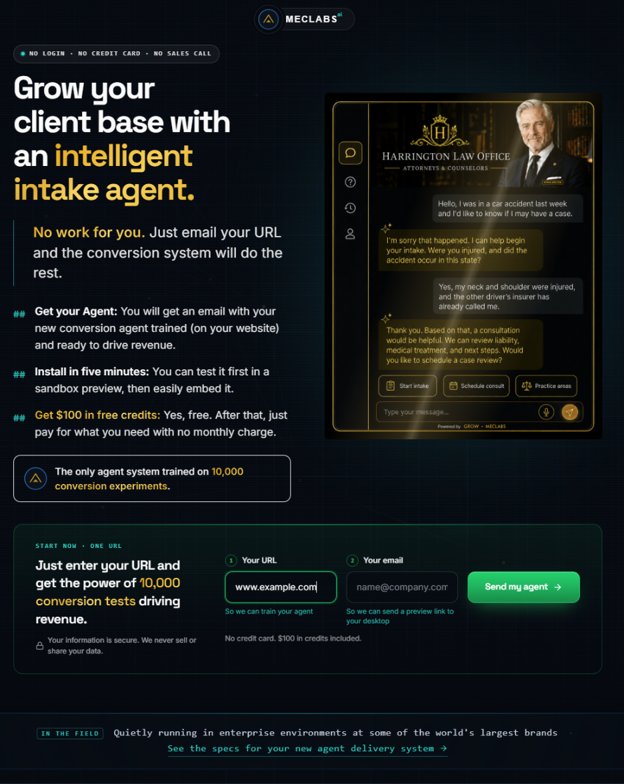
This landing page focuses on professional services teams/consultants who want more qualified leads without operational burden. Notice the headline is ‘Grow your client base with an intelligent intake agent.’ By focusing on only this group of people and only this feature of MECLABS AI, the headline reduces mental work by using the language commonly used by prospects in this industry.
With the ‘send my agent’ CTA, it takes them from browsing or considering options, to trying the specific product feature.
Prioritization is choosing where you can create the strongest value proposition with the lowest friction/anxiety for a motivated segment.
Again, this is easier for small companies. If you have one ideal customer set with one feature and one offer, your homepage is essentially your landing page.
But for a mid-market or bigger company, you have the opportunity – and corollary challenge – of deciding where to focus. There are many ideal customer sets you can serve with many features that can be presented through many offers. You multiply all of those three numbers together and it can be a lot.
Here are some factors that can help your team prioritize:
These questions hopefully help you prioritize which landing pages to launch. But they shouldn’t be the only thing your marketing is focused on.
For example, you may have an ideal customer set that needs to be educated first and won’t quickly turn into revenue. However, if they would be high-margin customers your company can truly serve and they have a high lifetime value, these prospects are certainly worth part of your marketing effort.
You just have to decide how to allocate those efforts. If you’re a bootstrapped, cash-flow-challenged company you will have to spend more of your marketing dollars and time prioritizing quicker-hit landing pages.
But if you work at a well-funded brand or a mature company with a healthy cash flow, you can allocate more of your marketing to long-term, sustainable approaches and just throw in a few quick-hit landing pages to help smooth out the results each quarter.
If your value proposition is vague, your visitors have to do extra work. Unless they are highly motivated, that friction is enough for them to bounce from your page.
To make this idea concrete for you, here are examples of common vague promises and how to make them clearer:
To sharpen your own value proposition, use questions like these:
Summarize all of this into a clear, simple line included in the brief for your team or an AI prompt – ‘For [audience], [offer] helps you [primary benefit] by [how it works / key differentiator].’
If you can’t write that sentence, you have a clarity problem with your value proposition and your offer.
Now, let’s look at a real-world example.
BEFORE
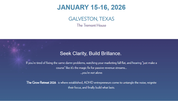
The look, feel, and structure of the homepage for a 10-year-old event hadn’t been updated in years. The team would just change the content to reflect each event’s theme.
Its most recent headline, which came under the date and location of the event, was ‘Seek Clarity, Build Brillance [sic].’
Creative Sample #2: Old version of hero
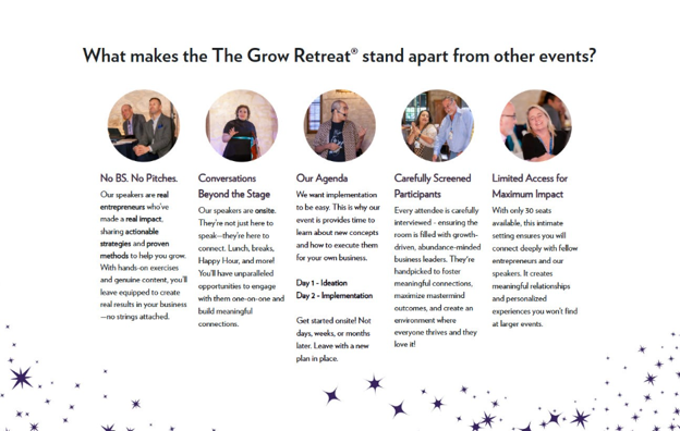
Lower down on the page, there was info about the event’s value proposition, with a focus on exclusivity.
Creative Sample #3: Old site’s fifth section
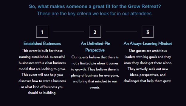
The site had a section to say who the event was for but mostly focused on positives and did not serve as much of a self-selection criteria.
Creative Sample #3: Old site’s ninth section
AFTER
On April 17, 2026, the team launched a rebuilt version. They made several changes, but the most prominent was reducing confusion.
“It was about clarifying and cleaning up verbiage to practice what we preach even on the website. We needed this website to be as ADHD friendly as our events are. That meant shorter sections, clearer headers, better photography, better use of our branding, and curiosity hooks that pull you forward instead of walls of text that make you check out,” said Stephanie Scheller, founder, Grow Disrupt.
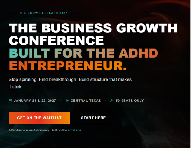
The new headline read ‘The business growth conference built for the ADHD entrepreneur.’
Creative Sample #4: New version of hero
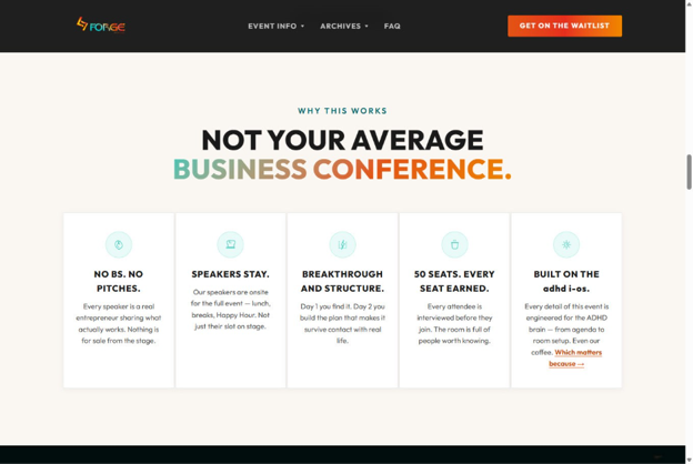
The new site had a similar section farther down the homepage that focused on the exclusivity of the event’s value prop, but it was shortened to make it a quicker read for visitors who scanned the page.
Every section included a micro curiosity hook designed to pull visitors to the next section or another part of the site. For example, the last column in this section had the copy ‘Every detail of this event is engineered for the ADHD brain – from agenda to room setup. Even our coffee.’ followed by a link with the copy ‘Which matters because →’.
That link took visitors to the next section which explained specific steps the team took to build an event for people with ADHD, including the coffee: ‘A proprietary blend developed from studies on cayenne pepper and cognitive function – specifically how it supports memory consolidation and helps move information from short-term to long-term retention.’
Creative Sample #5: New homepage’s fifth section
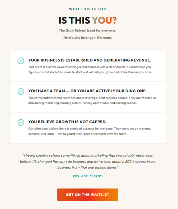
Farther down the page, there was a clearer section to help the ideal customer self-select, that included the line ‘The Grow Retreat is not for everyone. Here’s who belongs in the room.’
Creative Sample #6: New homepage’s ninth section
RESULTS
Comparing the same timeframe year-over-year from 2025 to 2026 (April 17th through July 25th):
“Before the redesign, people landed on the page and thought it was an ADHD event. It's not. It's a business growth event – it's just built in a way that ADHD brains can actually use what they're learning. That distinction was getting lost, and it was costing us the right audience,” Scheller said.
Let’s go back to that focus you created in Step #1. Is it clear on your new page? What do you want them to do? And what’s in it for them? There are three ways you can make the next step obvious:
In the below example, the search box is the real CTA – ‘search job title or keyword.’
But that CTA alone isn’t enough. Before your ideal prospect gets there, they need to understand why they should take the action and what happens next – which is why a head/subhead change had such a big impact on conversion.
BEFORE
The headline of Role’s homepage was ‘succeed with AI’ with a subhead of ‘Find jobs where AI helps you stand out.’
Creative Sample #7: Role homepage, before
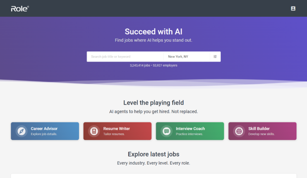
In one-on-one conversations founder Deven Patel had with job seekers, they didn’t understand the message on the page.
AFTER
So he researched some new headline options though “mostly research on Reddit/LinkedIn combined with ChatGPT around what the current pain points were for job seekers,” explained Deven Patel, founder, Role.
Patel ran an A/B test from April 3, 2026, to May 17, 2026. For the treatment, he changed the headline to ‘Find real jobs’ with a subhead of ‘Direct from employer sites. No ghosts. No reposts.’
Creative Sample #8: Role homepage, after
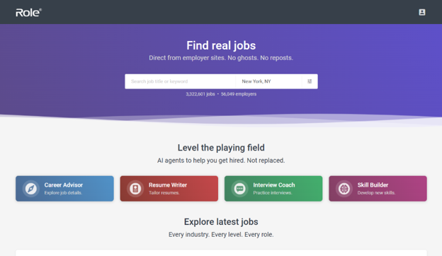
RESULTS
The first variant was shown to 1,207 visitors and the second variant to 1,379 visitors.
The conversion rate improved from 24% to 67%, a 2.8x improvement. “Makes sense in hindsight as ‘find real jobs’ was much clearer than ‘succeed with AI’ for the job seeker audience,” he said.
The next step after the search was job view. Since the results between the control and treatment were relatively flat (73% versus 67%), it indicates that nothing Patel changed to get more searches hurt the quality of the visitors moving on to the next step.
Action Box: Open your top landing page and rewrite only two lines
Rewrite the headline and subhead so they answer: Who is this for? What will I get? What happens next?
If you want feedback, post in the AI Guild community with your current headline/subhead and the one next step you want the visitor to take.
This article was distributed through the free MarketingSherpa email newsletter.
Related resources
How to fix websites where visitors browse but never buy
Landing Page Optimization: 5 factors that lead to (and prevent) conversion
Clarity Trumps Persuasion: 5 examples where clarity soundly beat out persuasion tactics
AI transparency
This is a human-conceived and -written article, assisted by AI. MeclabsAI was used to review source pitches for artificial intelligence usage, evaluate the credibility of potential sources, craft follow-up questions to sources, brainstorm the steps and advice in this article, create Open Graph and CMS thumbnail images, and provide copy-edit suggestions for the article.
Get Better Business Results With a Skillfully Applied Customer-first Marketing Strategy

The customer-first approach of MarketingSherpa’s agency services can help you build the most effective strategy to serve customers and improve results, and then implement it across every customer touchpoint.
Get More Info >MECLABS AI

Get headlines, value prop, competitive analysis, and more.
Use the AI for FREE (for now) >Marketer Vs Machine

Marketer Vs Machine: We need to train the marketer to train the machine.
Watch Now >Live, Interactive Event

Join Flint McGlaughlin for Design Your Offer on May 22nd at 1 pm ET. You’ll learn proven strategies that drive real business results.
Get Your Scholarship >Free Marketing Course

Become a Marketer-Philosopher: Create and optimize high-converting webpages (with this free online marketing course)
See Course >Project and Ideas Pitch Template
A free template to help you win approval for your proposed projects and campaigns
Get the Template >Six Quick CTA checklists
These CTA checklists are specifically designed for your team — something practical to hold up against your CTAs to help the time-pressed marketer quickly consider the customer psychology of your “asks” and how you can improve them.
Get the Checklists >Infographic: How to Create a Model of Your Customer’s Mind
You need a repeatable methodology focused on building your organization’s customer wisdom throughout your campaigns and websites. This infographic can get you started.
Get the Infographic >Infographic: 21 Psychological Elements that Power Effective Web Design
To build an effective page from scratch, you need to begin with the psychology of your customer. This infographic can get you started.
Get the Infographic >