By Anne Holland, President
This past fall, two different marketers from Siemens presented exclusive results from their recent multivariate Web site tests at MarketingSherpa's Summit. They tested several types of Web pages to see what design changes would improve response rates, including:
- Corporate home page design
- Product info page photos and copy
- Registration forms to gather opt-in emails
The test the creative team was most excited about was the product page photos. They'd had lots of internal debates over whether happy-people shots that the PR department adores would pull better or worse than technical product photos that turn on current customers.
Happy people won, much to the shock of the marketers, but the biggest shock was actually something completely different. Turns out that graphics, Web page design and copy tests all trailed in the dust of the big, BIG test results. Yes, the tests the team ran on opt-in forms wound up providing a far *higher* response lift.
The big lesson -- if you want to improve Web site results, don't waste time debating "creative." Instead, go for the high-impact stuff: opt-in form design tweaks.
A tiny opt-in lift means your email list grows bigger. And those names are better than any list you can rent or advertise on because they came from your Web site -- so they're already self-selecting. More high-quality names on your email list equals more responses to impress the CMO or CFO.
Inspired by this real-life story, I called up the folks at multivariate testing firm Optimost to see whether their clients were testing registration and opt-in forms. Turns out they had run tests for dozens of clients over the past year. Based on those tests, MarketingSherpa's research team worked with Optimost to develop a series of "rules" for opt-in forms that generally tended to lift or depress response. You can see an illustration of one such rule immediately below and a link to a report with the rest at the bottom of this column.
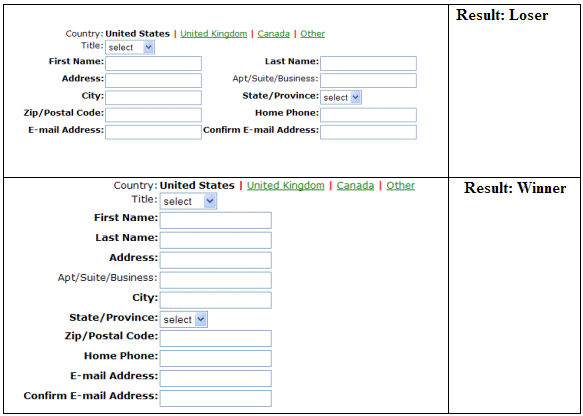
Source: Optimost for MarketingSherpa, November 2006
As you can see above, one of the rules was that vertical forms work the best. If you have to ask many questions, don't give folks two columns of forms to fill out. (BTW: If you have an ecommerce cart that uses columns for shipping vs billing address, you may want to test changing that.)
The common key to all the lessons was that testing your opt-in form works gangbusters. So, if you have the budget for a multivariete study, that's a great page to focus on.
But, what if you don’t have much in your testing budget? You can still tweak your form. At the very least, you can probably work with your Web design department (or email service provider if they "power" your form) to try several different versions … either as an A/B test if your servers can handle it or as a week by week test (one week is one form, the next a different version, etc.). Goal -- you need at least 100 form fills per test cell to determine useful results.
Five suggestions of possible tests worth your time:
1. Offer
Should you offer a discount coupon or white paper to be emailed out to everyone who fills it out? Don't assume an added inducement to sign up is going to increase response rates. The Motley Fool told me they tested both ways -- giving away a free ebook with free subscription vs not. The no-offer test won.
2. Image of offer
This is often very powerful. Should you have a small thumbnail of what looks like a newsletter or sales alert issue? If it's a white paper or e-coupon, should you "show" an image of that?
3. Amount of information requested
You probably know that less info means you’ll get more form fills. On the other hand, some bits of data don't make a big difference depending on how trusted your brand name is. For example, our own house tests have shown that asking for first name, last name in addition to email address doesn't hurt results. A bridal photographer told me his online email lead generation form gets better fills when he adds a "your wedding date" field, even though that won't affect what he sends the bride-to-be.
However phone numbers always crush the reply rate.
4. Description of email that will be sent
Don't assume the terms "email newsletter" or "news" or "get email from us" are remotely enticing. You can name your regular email program anything you want -- and each name carries different shades of interest and meaning. For example:
- Hot sales alerts
- Monthly Journal
- Success Profile Series
- Private sale announcements
- Tips
- Video magazine
- Ten-step eCourse (value $29.95)
5. Submit button copy
Definitely worth testing. Don't assume "submit" or "subscribe" is the killer copy here. Plus, do assume you have more space to play with than you may think. Buttons can widen to contain several words. Whether that helps response or not depends on the words themselves.
Useful links related to this articleMarketingSherpa's Email Marketing Benchmark Guide 2007:
http://www.sherpastore.com/email-benchmark.html?8966
MarketingSherpa's vendors:
http://www.marketingsherpa.com/vendors.html


