

|
SUMMARY:
This article walks you through actionable steps to boost your landing page’s conversion rate. Read on to get ideas for changes that make your value proposition clear, are measurable, and drive customer engagement. |
Action Box: AI workflow can help do this with you
MeclabsAI can do it with you. Try the multi-agent workflow How To Create Offers Customers Can’t Resist (MeclabsAI is MarketingSherpa’s parent company).
You can’t improve something until you know what you’re improving, and who you are improving it for.
So begin by setting clear objectives. A conversion rate can be many things. What are you really trying to achieve? It is more form submissions? Calls? Appointment bookings?
When you take some time to really think through your conversion objective, you may find a shift is necessary. For example… “While we spent our first two decades in business driving up website conversion percent, we established a new website goal: reduce cost per quote,” Casey Halloran, Co-Founder and CEO, Costa Rican Vacations, told me in Small Business Marketing Strategy: Get ideas for conversion optimization, social media strategy, and lead generation.
You can’t determine that conversion goal in a vacuum. Half of getting the right goal means gaining a true understanding of what your business needs right now.
But the other half of it is aligning the page goal with what your local customers truly need. In other words, focusing on a customer-first conversion ask.
To do this, you must know your audience. Develop customer profiles using demographics and pain points. Use feedback and data to refine your ideal customer profile.
And review all your previous test results and see what you learned. We discuss testing more in Step #6, but it’s worth mentioning that a testing program can create a continuous cycle of improvement.
Through testing, you can learn more about your customers to better serve them. By testing, you will see if these new things you learned improve your landing page results. And you will again learn more about your ideal customers.
But it can’t just be random changes – a button color here, a keyword there. Your tests should be informed by what you know about the customer with the goal of learning even more.
"When I think back to where we were two and a half years ago, the biggest issue with our testing program was that we tried several small ideas in different places and didn't iterate enough on concepts. Our ideas were driven by individual opinions and changes that we saw our competitors making, which is one of the worst ways to run a testing program,” Daniel Layfield, Product Manager, Codecademy, told me in Subscription Marketing Experiments: Quick case studies about pricing, landing page, and SEO tests for recurring revenue businesses.
“The tide turned for us when we began focusing on our own learners and what we knew about them – their perceptions of our product and consumer behavior that was supported by evidence,” Layfield said.
So when creating your conversion goal, approach it with that mindset – as something that will help you better understand your customers through testing while helping meet your business goals.
Now that you have a better understanding of who you are trying to serve and what you would like them to do, how well does your current landing page meet these objectives?
Perform a detailed audit. Look at key metrics: bounce rate, session duration, and form abandonment.
It might also behoove you to add technology to your site (or use technology you already have) to better understand how your ideal customers are currently interacting with your landing page.
For example, Captain Experiences aimed to boost homepage searches to drive higher engagement and propel consumers further down the conversion funnel. “We noticed our numbers weren’t quite where we wanted them to be in terms of searches/total users on the site so we used Hotjar to see what was happening,” Attison Barnes, co-founder and head of product, Captain Experiences, told me in Conversion Rate Optimization: 4 quick CRO case studies to help you increase revenue, mobile conversion, and site searches.
If you can’t install tools or set up user experience testing, get creative. Don’t let lack of resources stop you. Maybe you bring your laptop to a home expo or have a QR code at the farmer’s market and watch how customers interact with your landing page in real time.
Whether you use software tools or just try to watch customers in action, your goal is the same – identify friction points that cause visitors to leave.
Pair this customer observation with your own team’s review of the landing page. You can use the Meclabs Conversion Sequence heuristic to guide your analysis (MeclabsAI is the parent company of MarketingSherpa).
Ensure each element – motivation, value proposition, incentive, friction, and anxiety – is addressed on your landing page. Here’s a quick, simple example of how you can use this heuristic on your landing page yourself (or try the multi-agent workflow mentioned in the Action Box at the beginning of this article and MeclabsAI can help you apply the heuristic to your landing page):
By combining data-driven audits to help pinpoint exactly where to cut friction, with your own team’s gut insights on what other elements to improve to better serve the customer, you’ll come up with many ideas for improvement.
Prioritize which changes will have the biggest impact (you can always try lower-impact changes later). And then it’s time to roll up your sleeves and get to work. Let’s start with your page’s messaging.
While the format of a step-by-step article makes every step look relatively equal in importance, this step is by far the most important.
What should you say to customers? And how should you say it?
This means getting the word on your page right, of course. Creating a compelling headline. Writing a headline that resonates directly with local problems or goals. And using concise language that cuts through clutter.
But I like to describe writing this way – 80% of good writing is having something worth saying, the other 20% is saying it well.
So ask yourself – what is the pain or goal of the person visiting this page? And what do they need to hear from your business at this point in their customer/life journey?
“A homeowner with a burst pipe isn’t browsing – they’re scanning for help,” said Dave Charest, director of small business success, Constant Contact. “We’ve seen small businesses – from HVAC techs and plumbers to pet groomers and mobile detailers – increase conversions simply by fine-tuning their messages to match customer needs and offer a fast, clear next step.”
For a local service business landing page, a key part of having something worth saying is presenting customers with the right next step (i.e., the conversion ask) as discussed in Step #1. What will best serve them? So after doing the analysis discussed in previous steps, you may discover that you should try changing or simplifying your offer.
Then, explain the key benefits of that offer in short, direct bullet points. And incorporate local testimonials, awards, or recognitions to build trust and let them know that your company is worth taking the chance on with this offer.
Your landing page should communicate two key pieces of information to your ideal customer – what you can do for them (the appeal you’ve worked on above), but also being clear about where you can do it for them (which can add an element of exclusivity for a local business).
“Specificity builds trust,” said Matt Aird, chief technology officer and co-owner, Custom Neon. His team builds local landing pages for the markets it serves. For example… “We used SEMrush to look at popular search terms. We also tested a few options, but ‘Melbourne’s Best LED Neon Lights’ stood out because it acknowledges the geographic location and says what we are, ‘The Best,’” Aird said.
Let’s take a look at some more examples to help spur ideas for your own landing pages.
Tommy Sugo is a gourmet meal delivery company.
BEFORE
The company’s landing page had plenty of visitors from SEO and social ads, but too few were turning into paying customers. The conversion rate was stuck at around 2.2%.
After analyzing the page, the team felt it had a generic headline – ‘Fresh Pasta Delivered to Your Door’ – that didn’t convey the company’s Perth roots or family-run story. It could have been selling pasta in any city. Yet almost every order was from Perth locals.
And there was no strong reason for first-time visitors to act.
AFTER
So the team localized the message. They changed the headline to ‘Perth’s Fresh Pasta Specialists - From Our Kitchen to Your Table Tonight,’ with photos of local employees making pasta. They also weaved in the company’s local roots – a little nod to Kings Park here, a mention of weekend markets there.
As an incentive, they added a zero-cost lead magnet – a free ‘Tommy Sugo Pasta Lovers’ Recipe Pack’ for email sign-ups, featuring family recipes and tips.
And they simplified the CTA – one clear ‘Order Fresh Pasta Now’ button replaced multiple scattered calls-to-action.
RESULTS
The conversion rate more than doubled to 4.6% and the bounce rate dropped 23%. The team was also about to grow the email list 800+ in the first month. And income from online conversions doubled in July compared to the previous month.
In addition to improving on-page conversion, the local focus also helped the team get more local traffic to the site. “Google Search Console told us where we were climbing in searches, SEMrush and Ahrefs showed keyword wins, and Analytics tracked organic traffic and referrals from foodie blogs,” said Nathan Baws, founder, Tommy Sugo.
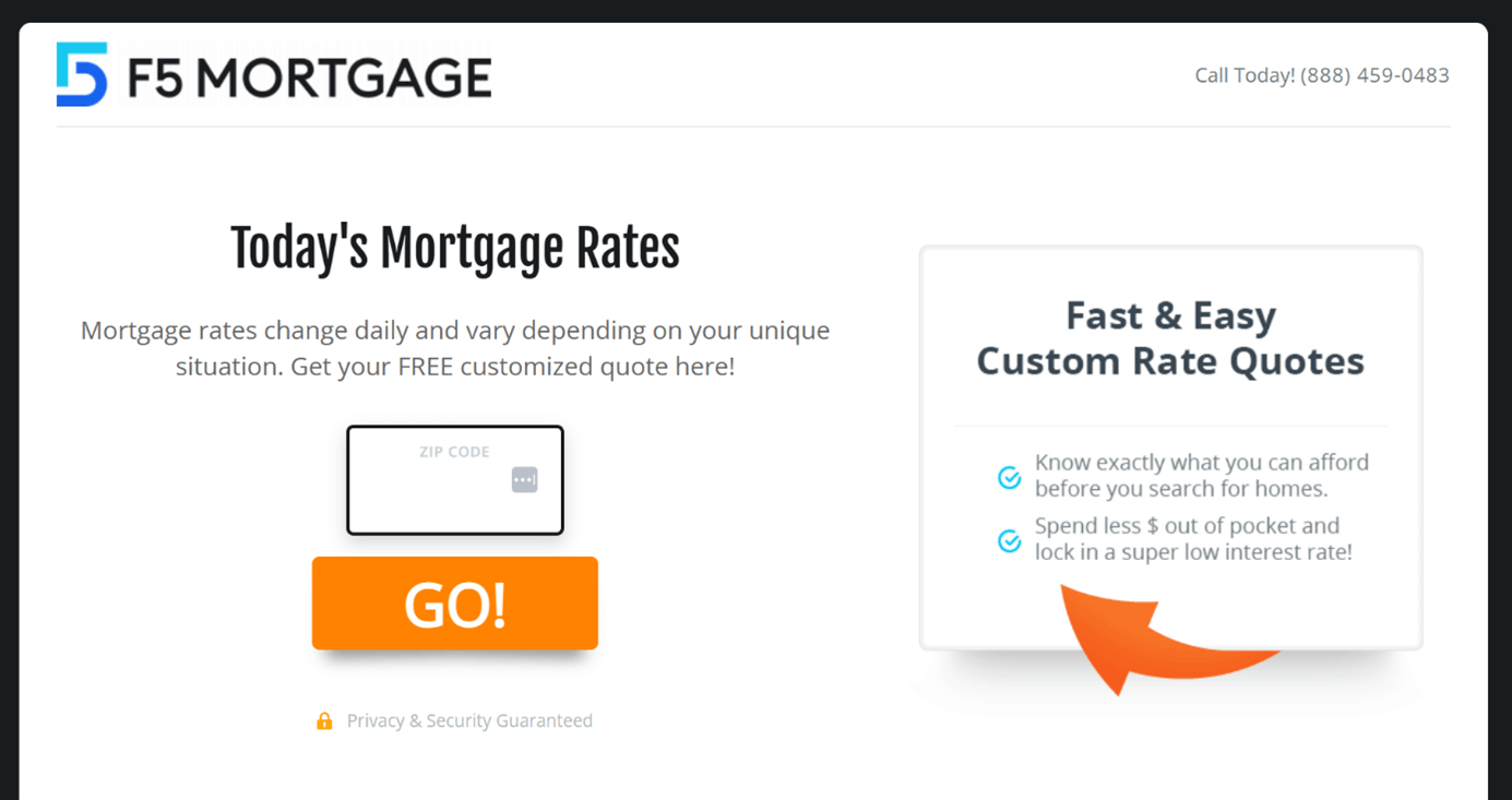
F5 Mortgage is a mortgage broker in Grand Traverse County, Michigan.
BEFORE
The original landing page focused on the most recent mortgage rates, and the ability to get a quote. The main headline was ‘Today’s Mortgage Rates.’
Creative Sample: Original landing page
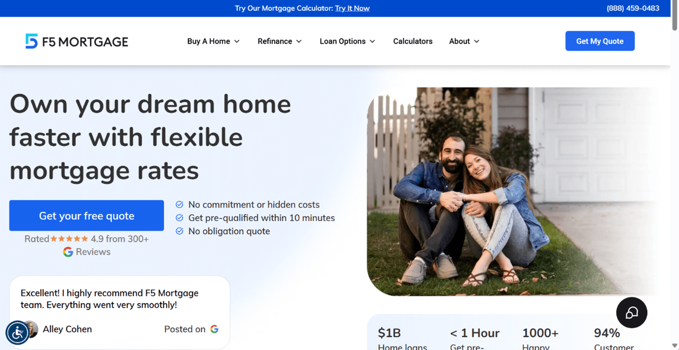
AFTER
The team felt they needed to do a better job of communicating the company’s value proposition. They designed a new landing page with the headline ‘Own your dream home faster with flexible mortgage rates.’
Creative Sample: Control landing page
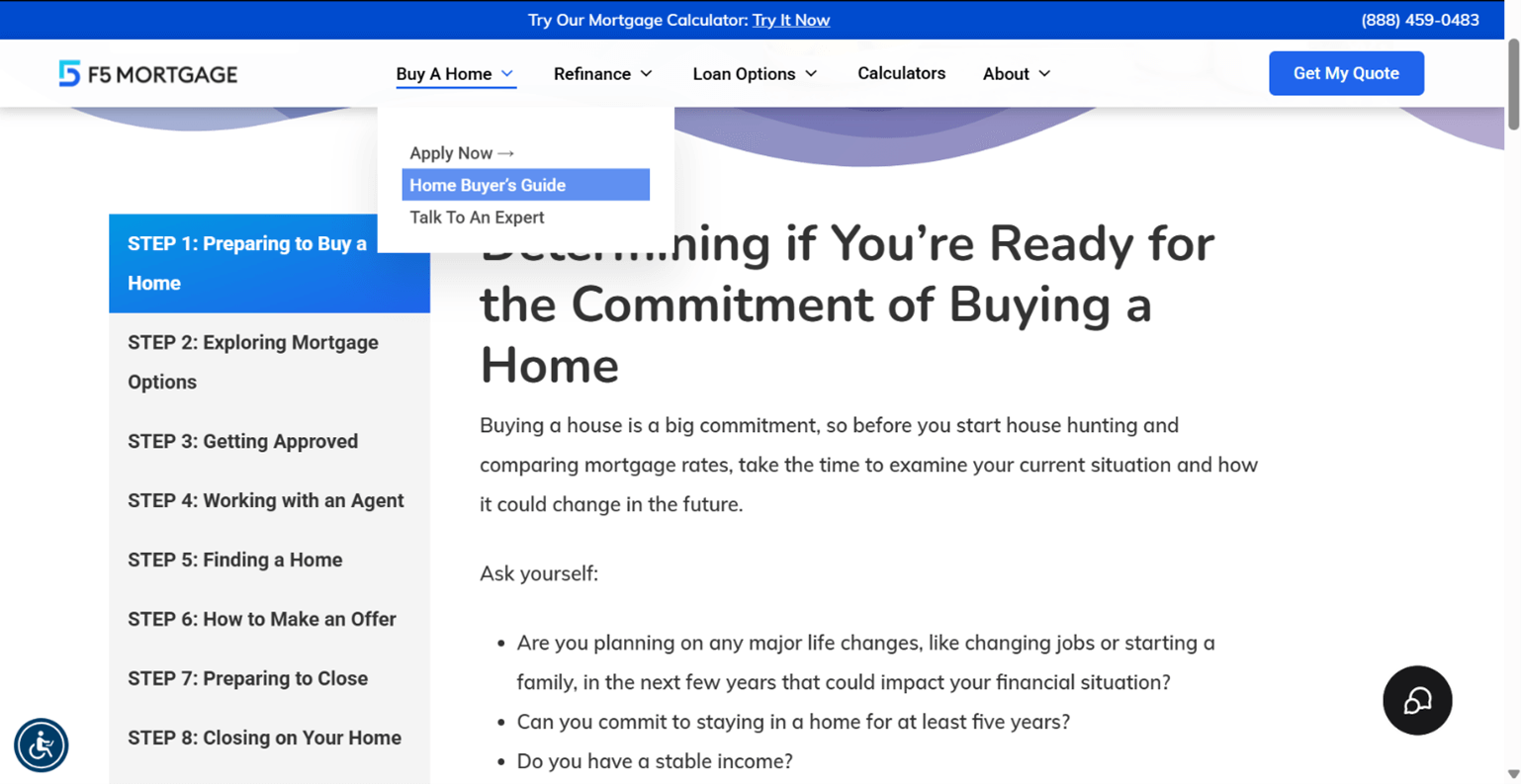
In the ‘buy a home’ section of the nav, the team added step-by-step instructions in a home buyer’s guide, from Step 1 ‘Preparing to Buy a Home’ to Step 8 ‘Closing on your Home.’
Creative Sample: Home Buyer’s Guide
RESULTS
The conversion rate nearly doubled, to 1.7 percent.
“The moment a customer visits it [your page], he or she must know what you can do and why it is important to them,” said Ryan McCallister, president & founder, F5 Mortgage.
Now that you’ve got the message right, streamline the conversion process. Reduce unnecessary steps, such as lengthy forms. And structure your content to help the ideal customer easily absorb it, like in this example.
The team at National Positions was working with a local property management client that both manages rentals and lists vacancies.
For the vacancies page, the company included qualification criteria in large blocks of text.
As part of a page redesign, the team put the qualification criteria into a scannable, visual format – a simple checklist.
“That small change made it much easier for applicants to quickly self-assess and understand whether they qualified – leading to fewer drop-offs and more confident submissions,” explained Tess Listick, director of CRO, National Positions.
When you’re optimizing for user experience, ensure your page is optimized for mobile. After all, many local searches happen on the go.
Part of that mobile optimization should focus on the CTA, like in this next example.
“Make your CTA always visible. Meaning not just have it on the page somewhere, but have it always be no more than a ‘thumb’s length’ away. That often means a sticky header/footer or floating button that follows as you scroll. Not intrusive but just easily available when you’re ready to act,” advised Greg Cox, founder, WebPilot.
For example, the team implemented this approach for a solo audiologist.
The ‘Contact / Request Appointment’ button was initially only at the very top. Once visitors scrolled past it to read about services or reviews, there was no easy way to book without scrolling all the way back up.
The team added a sticky bar at the bottom of the screen with two simple options: ‘Schedule’ and ‘Call.’ It stayed visible the entire time. Almost immediately that became the dominant method people used to initiate contact or book an appointment, instead of them leaving to ‘think about it’ (and never returning).
The team added the secondary ‘Call’ CTA because the core demographic skewed older, and they may be more comfortable making contact or asking preliminary questions via phone.
“Often times, marketers ‘hide’ any other actions with the hope that if you force the customer down only one road then they will have no choice but to convert. I feel like this is a user-hostile approach that doesn’t align with how customers typically think and behave, especially on purchases that require a higher level of consideration,” he said.
After changes like this are made, the team continually audits pages for usability to make sure the CTA, and everything else with the page, serves the customer (as discussed in Step #2).” What we’ll often do is set up a heatmap tool – Microsoft Clarity, Hotjar, etc. – and observe sessions over a period of time,” Cox said.
In this case, user sessions showed the sticky CTAs quickly became the primary CTAs and that the amount of ‘wandering’ on the website noticeably decreased as people were able to more quickly identify and access their intended action.
Now that you have your new page ready, give it one last gut check. Walk through it like the ideal customer would. Do all the individuals changes add up to a whole that guides and serves the customer?
A helpful protocol is the Meclabs Micro-Yes Architecture.
“The funnel represents and should be thought of as a representation of what is the heart of marketing, and that is a series of decisions. Those decisions are key transitions; I would call them micro-yes(s). There are a series of micro-yes(s) necessary to help someone achieve an ultimate yes. The Ultimate Yes is the sale in most cases. At each of these junctures, we have to help people climb up the funnel,” explained Flint McGlaughlin, CEO, MeclabsAI and MarketingSherpa, in Conversion Rate Optimization: Building to the Ultimate Yes.
Use the Micro-Yes Architecture (MYA) to ensure every element of your page (and by extension, your funnel) drives an action. For example:
You can document your findings with a checklist to track which elements need revision or enhancements and share with your team.
Before you launch these changes, establish a testing framework so you can evaluate their effectiveness, and further learn from your customers to improve.
A testing and feedback loop starts with being clear about why you are making the changes that you are making. A helpful framework is Meclabs Scientific Messaging Hypothesis. You can get a specific breakdown of how to use it at the above link, but here’s a simple example of a hypothesis:
Once you’ve firmly defined your hypothesis, then you can run tests to learn from your customers. Experiment with different CTAs, layouts, and value propositions. Use the data to iterate and continuously improve the page.
Like in our next example, you don’t have to test everything. If something is broken, it makes sense to fix it. But once you’ve got past that low-hanging fruit, testing will help you discover how other changes impact results.
The team at POLARIS was working with a London-based commercial awnings brand. The team began an analysis of the company’s landing page.
“The key GA4 data was the conversion rate segmented by device and also a review of the site duration/page engagement/exit and bounce rate,” explained James Foote, SEO director, POLARIS. They also used Hotjar and Clarity looking at heatmaps to review scroll depth.
“Our macro-analysis highlighted a fundamental issue: the mobile site using WordPress Elementor was a compressed version of the desktop, which didn't take into consideration how users navigate on smaller screens,” Foote said.
So the team dove into the technical elements of the landing page.
“Using third-party browser shots to run multiple OS checks through Android and iPhone, [we] could see a similar pattern,” he said. They found a number of broken elements – i.e. header bleeding into the hero image.
Once they had this knowledge, they delved further into the CMS to fix these issues. “Working with WordPress sites built with Elementor, you have to define what sections to exclude/include into the mobile viewpoint, otherwise the page builder just uses the desktop compressed into linear vertical blocks,” he explained.
After they got the low-hanging fruit – the technical fixes – they hypothesized on ways to increase conversion. Like in the example mentioned in Step #4 previously in the article, the team added a sticky call-to-action footer banner – ‘Enquire Now’ – and then tested to see how this change would impact results.
“All tests we carry out follow the same path; create a hypothesis, design a methodology, benchmark performance, run A/B tests on control and variant – after 90-days review the results to define statistical confidence usually,” Foote said.
After 90 days, mobile inquiries increased by 129%.
But this improved usability and conversion optimization helped boost local SEO as well. “Google's ranking systems track page engagement and task completion, this action directly influences SERP visibility,” Foote said. In this case, ranking positions for core transaction KPI queries improved by 51%.
“The approach validates what SEOs have known all along. Google’s objective is providing the best result. Focus on task completion – not having a high-exit or pogo sticking back to the SERPs. Google rewards brands that can offer this experience. Google rewards sustained user engagement over time,” he said.
Before I end this article, I want to share one last example. While we often think of a local service business as an SMB, national brands also sell services locally. So they have many of the same challenges as the local SMB service business, but one additional challenge – connecting with local employees across the country.
The team at KWI Communications was working with a national telecom provider whose frontline construction teams were disengaged, dispersed and difficult to reach.
The team started with a deep-dive survey to surface broad themes and pain points, then zoomed in to see how the results applied to regional nuances, demographics and workplace subcultures.
They followed up by testing their insights in focus groups.
“A ‘test’ for us might be trying a new format in a controlled setting and then listening, measuring sentiment and engagement, and adjusting in real time. It’s less about rigid A/B tests and more about iterative insights, scanning for patterns, piloting formats and fine-tuning based on what gains traction,” explained Leah Gladu, CEO, KWI Communications.
They discovered that instead of all-in-one messaging from national executives, frontline employees only wanted to hear from their direct leaders, and their managers had the same opinion.
So the team tried a new format. They tapped into the pride these employees felt in their craft and made frontline supervisors the primary messengers, equipping them with ‘meeting-in-a-box’ toolkits.
Engagement scores rose by more than 10 points year over year, trust in leadership increased by 33%, and new communication tools achieved a 90% adoption rate. The company was able to scale three times in 18 months, contributing nearly $1 billion in revenue.
Join us for AI Executive Lab: Transform billable hours into scalable AI-powered products on October 1st at 2 pm EDT.
Landing Page Optimization: Free worksheet to help you balance segmentation and resources

Join our thousands of weekly case study readers.
Enter your email below to receive MarketingSherpa news, updates, and promotions:
Note: Already a subscriber? Want to add a subscription?
Click Here to Manage Subscriptions
Get Better Business Results With a Skillfully Applied Customer-first Marketing Strategy

The customer-first approach of MarketingSherpa’s agency services can help you build the most effective strategy to serve customers and improve results, and then implement it across every customer touchpoint.
Get More Info >MECLABS AI

Get headlines, value prop, competitive analysis, and more.
Use the AI for FREE (for now) >Marketer Vs Machine

Marketer Vs Machine: We need to train the marketer to train the machine.
Watch Now >Live, Interactive Event

Join Flint McGlaughlin for Design Your Offer on May 22nd at 1 pm ET. You’ll learn proven strategies that drive real business results.
Get Your Scholarship >Free Marketing Course

Become a Marketer-Philosopher: Create and optimize high-converting webpages (with this free online marketing course)
See Course >Project and Ideas Pitch Template

A free template to help you win approval for your proposed projects and campaigns
Get the Template >Six Quick CTA checklists

These CTA checklists are specifically designed for your team — something practical to hold up against your CTAs to help the time-pressed marketer quickly consider the customer psychology of your “asks” and how you can improve them.
Get the Checklists >Infographic: How to Create a Model of Your Customer’s Mind

You need a repeatable methodology focused on building your organization’s customer wisdom throughout your campaigns and websites. This infographic can get you started.
Get the Infographic >Infographic: 21 Psychological Elements that Power Effective Web Design

To build an effective page from scratch, you need to begin with the psychology of your customer. This infographic can get you started.
Get the Infographic >Receive the latest case studies and data on email, lead gen, and social media along with MarketingSherpa updates and promotions.
