Late last summer, MarketingSherpa published a series of articles on how marketers should consider revamping their email designs to comply with preview pane use and image blocking (see link below).
The problem was that while we knew roughly 69% of at-work email users usually view emails in their preview panes, no one had any hard data on consumers.
So, consumer marketers weren't sure if they should redesign for preview and image blocking or keep doing business as usual. This January, we partnered with Survey Sampling International to solve this problem. Here are the fascinating results of our new research:
(Note: As always, please do not break our copyright by copying these charts. You may, however, hotlink to this article.)
Chart #1. Percent of Preview Pane "Capable" Email Users Who Deploy Them: B-to-B vs. B-to-C
Note: The B-to-B data is from an EmailLabs study as of October 2005. We suspect that number is stable or even higher because nearly 80% of at-work users in the US rely on Outlook, which offers preview panes.
The B-to-C data is from our own new study, conducted in late January. These are people who use email clients such as Hotmail, Yahoo, AOL, EarthLink, Outlook Express and Gmail.
Older "classic" versions of these email clients usually didn't have preview panes, which is why it was not a big issue in consumer email marketing up to this point.
However, in our study, we discovered a full 38% of online consumers now use preview pane 'capable' email clients. That's a large swathe of the US population, and the number is growing steadily as companies such as Yahoo heavily promote upgrades.
Consumers who switch to these services strongly prefer to use preview panes. In fact, 64% of people who are offered preview panes start using them as their default.
What does this mean for marketers? More than one out of four consumers see just a corner of the beautiful email creative you sent them. They may not open up to look at the entire image at all. (No, your open measurements will *not* tell you who views in preview and who opens all the way.)
So, your offers and newsletters are being judged on the basis of a corner. Can you imagine if people judged your print ads by just a corner of the creative? Or your TV ads by just a few frames? That's what's increasingly happening with email.
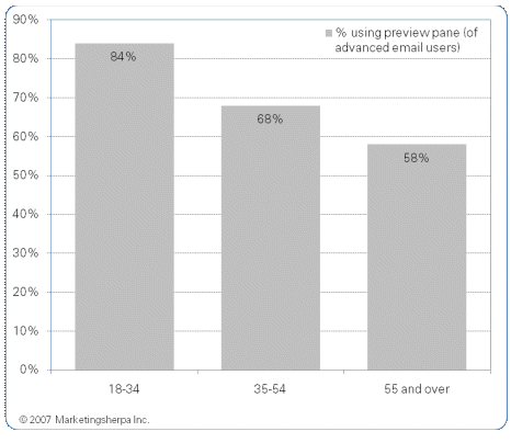
Chart#2. The Demographics of Preview Pane Use Among Consumers
The data above focuses on the 38% of the online consumer population who are currently using advanced or new versions of email clients with preview pane capabilities.
We sliced responses into three roughly generational groups to show you which consumers are more likely to be using preview panes. As you might have guessed, the younger you are, the more likely you are to use advanced email bells and whistles. However, we were a bit surprised to see how high preview pane use is in the oldest generation. Grandma, we didn’t know you were so sophisticated!
This amply illustrates that no consumer marketer is safe from the preview pane problem. All generations are using them.
One more demographic note: Although we're using the term "consumers" here, marketers should be aware that this demographic includes a large number of small businesspeople who often rely on free or ISP email services.
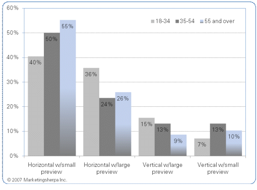
Chart #3. Specific Types of Preview Panes Used: By Demographic
To cope with the preview pane challenge, first, your email designer or template team need to understand what size and shape panes are. What can consumers see and what can't they see?
Once you know what corner of your email creative they are looking at, you can move calls to action, hotlinks and highest-impact creative to that corner to increase response.
As you can see from the chart above, sadly, that space is not always large. Consumers tend to prefer smaller preview panes -- they are sure they can judge whether your email is worth looking at or responding to by just glancing at a small piece of it.
Happily, most prefer the horizontal version to the vertical. The horizontal is a bit easier to design for.
Not sure what each version looks like? Scroll down to our hotlinks section below, where we've posted a collection of screenshots of each version and size. By the way, thanks to MSN for the newsletter sample used there. You guys invented preview panes so we figured it's only fair to view your mail in them.
Chart #4. Percent of US Online Consumers Blocking Email Images by Default: By Demographic
You may be surprised to hear that this chart is actually fairly good news. Recent industry expert estimates of image blocking have been in the 60%-70% range. Turns out the experts were wrong. Fewer than 50% of consumers routinely block all images.
However, bear in mind this chart is not just about preview pane or advanced email client users. This chart is about everyone we surveyed, so it applies to all consumers.
Have you viewed your own email creative with images blocked recently? Judging from our in-boxes, we know of many, many marketers who are in for a nasty surprise when they finally take a look.
Now, we're not suggesting that you stop using images in consumer emails. MarketingSherpa studies show that images, when used appropriately, can significantly improve responses from consumers who see them.
However, from now on, when your creative team shows you email to approve, we suggest you refuse to OK anything unless you get three versions to approve at the same time:
1. Preview pane version - at least small horizontal.
2. Images blocked version.
3. Regular full-screen glory version.
Research Methodology and Quick Notes:Survey Sampling International fielded this survey on MarketingSherpa's behalf Jan. 19-25, 2007. 1,323 online consumers ages 18 or older responded. They were representative of the US online population as a whole.
Key: We didn't just ask questions and rely on consumers to check the right box. Instead, we gave respondents plenty of screenshots so they could see what we were asking about. For example, when we asked Hotmail users which version of Hotmail they used, we showed them pictures of different versions to pick from.
Why is this important? Well, we doubt that some people would know which particular email client version they're on or what size preview pane they use. So, why risk getting a wrong answer?
Useful links related to this article:Screenshots of how preview panes appear in email browsers:
http://www.marketingsherpa.com/cs/previewpanes/study.html
Survey Sampling International - the consumer research firm with whom MarketingSherpa partnered to do this study:
http://www.surveysampling.com/
Related Sherpa articles:
Case Study: Sierra Club Tests Radical Email Newsletter Redesign to Improve Preview Pane Viewing
https://www.marketingsherpa.com/article.php?ident=29668
How-To: Why (and how) You Should Redesign Your Email Templates for Outlook, Hotmail & Yahoo Immediately -- Includes Data Charts from original EmailLabs Study
http://www.marketingsherpa.com/article.php?ident=29662


