by
Courtney Eckerle, Manager of Editorial Content
THE CUSTOMER
The Clymb is an ecommerce fitness and adventure retailer that offers gear, apparel and tools, as well as trips that get customers out into the world and using all the gear they might need.
"We sell some of the leading brands and some of the best products out there and at a really great price," Sarah Lewis, Email Marketing Manager, The Clymb, said.
The Clymb’s typical customer is an active lifestyle enthusiast, Lewis explained.
"People who like getting outside regularly, want to learn more about it and who we can make that process easier for through what we sell and also through the information that we have available on our website," Lewis said.
Lewis said her and her team’s goals right now are to let their customers know who the brand is, "why we're here for them and how we can be of service to them."
They are trying to accomplish that through email, the website and social media, as well as an app.
CHALLENGE
The team had a wealth of content, but wasn’t leveraging customer data to optimize revenue generation and drive lifetime value. They wanted to create a personalized experience for each individual user to solve this problem by combining email and on-site behavioral data.
This campaign focused on the daily email campaign that goes out every morning, and has been the main staple of the email program since the beginning of the company. The challenge with this email, according to Lewis, was making it competitive in someone’s daily inbox.
"We've tried different versions of it, we've tried different information in it, [but] we had gotten to the point where we realized we might need to step it up a notch," she said.
The team set about this through three objectives:
- Find a way to get information to the right people
- Make sure they see it
- Make sure they want to see it
CAMPAIGN
The daily email’s content mainly consists of what is new on the website. This includes products, events and other adventures that the team thinks will engage people and bring them onto the site.
In the summer of 2014, Lewis and her team began aggressively working to personalize the email program. Going into the effort, Lewis said the team wanted to improve revenue, but "beyond that we really just wanted to get our customers more engaged. And we thought that we could do that by catering directly to them using information that we knew about what they were interested in."
Rather than sending its entire list the same generic email every day, The Clymb began to personalize email content and offers based off of customers' behavioral data.
Step #1. Optimize system to increase engagement
The team was looking to increase opens, clicks and conversions, according to Lewis, but overall they wanted to develop a long-term interest.
She said they wanted to attract "not just people coming in for a quick deal or offer, but somebody that's going to stick around and then maybe be so excited about us that they would share with their friends, or just want to keep informed on what was happening with us on a day-to-day basis."
The team took time to enlist a vendor, align the technology and readjust the system for collecting data in order to utilize it for greater relevance.
"[We] reorganized how all of our events were tagged, and ordered both what's in the email setup and what's on our website," she said.
They also added a robust tagging system to the website to learn more about the interest data of members, a group that consists of both email and non-email subscribers.
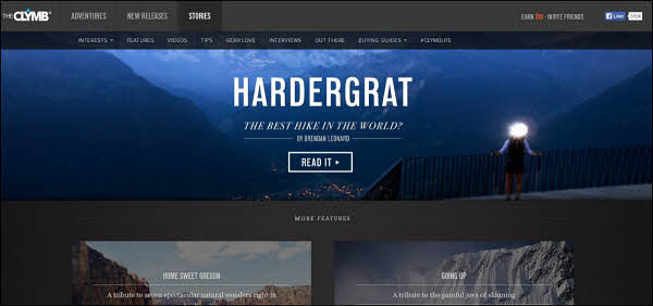
Utilize content

Click here to see the full version of this creative sample
"We have this section of our website called Stories, which is basically
our blog. It has a combination of adventure stories from writers from around the world, as well as tips and guidebooks — basically anything you could want to know about going on an adventure, getting outdoors, what the best shoes are for you to wear for different activities," Lewis said.
The team is working toward better incorporating that content into their emails, she added.
The challenge with that goal, she said, has been finding a balance between sales and stories. The team has a copywriter who works with a number of different writers at The Clymb.
"We already have a ton of information, so the real challenge right now is making sure that people are seeing this information. It's on our website, but it doesn't particularly stand out unless you're searching for it, and it hasn't been prominent enough in our emails up until very recently," she said.
Step #2. Update email template to better align with customers
"Once we had that set up, we started working on our email template to update it a little bit to really align it better with the look and feel of our website and also to best present it for a more personalized version of our email," Lewis said.
Originally,
the daily email consisted of a series of similar-sized tiles.
"They all had the same level of importance. On one side we had women's [products], on the other side we had men's," she said.

Click here to see the full version of this creative sample
Additionally, having the tiles be the same size decreased the importance of some offers that the team would otherwise want to draw subscriber attention to. By updating the templates, the team could prioritize what they wanted to promote and prioritize what they thought each person would want to see.
The team came up with
a new email template that has one big featured event and four small event tiles at the top that are "featured." Eight additional event tiles of the same smaller size are below that.

Click here to see the full version of this creative sample
The featured section has always been manual, consisting of solely what the team finds most valuable. However, every other event can be based on each person’s interest profile in two ways. Event tiles included could differ based on interests, or the standard tiles could be ordered differently to prioritize the ones most closely associated with user’s interests.
The email tiles lead back to the website, and having the email and website align with each other created a consistent focus across all platforms.
"It gave us a different kind of alignment, and let us really explore how we can find that balance between what's important for us to get out and then what's important for our customers to see," she said.
Step #3. Test the technology throughout the process
"We love testing here, and did everything from internal testing to making sure the technology worked," Lewis said.
The team did smaller A/B tests within the body of the email, not only to see how the personalized email was doing alongside the traditional static email, but to see what versions of the personalization would suit them.
Initially for the testing, 20% of the daily email list was segmented out to receive the new version of the email. As they continued, if they wanted to test any changes, a different 20% would get an updated version.
"The first test that we ran was just a simple A/B test of our original email template versus the new email template. We actually ran that even before we implemented the personalization just to see how those two compared since they were so different on desktop and mobile views," Lewis said.
The team saw an increase in interest on the new template and, once they did, they were able to use the new template to add in the personalized information.
They also launched a test on a dynamic, personalized subject line. Originally, the subject lines on the daily emails were taken from the short bit of information that is written about each event, and the team would choose which one would be the subject line for that day.
The updated version is simpler, Lewis said.
"Each event within the email gets what we call snippets, so it would be the brand name or sandals if that's what the event is, just some basic pieces, information about that event. And then the featured event will always be the number one item in the subject line and beyond that the rest of the snippets, up to five additional, will be reorganized based on how the body of the email has been reorganized for each person's personalization profile," she said.
When testing the dynamic subject line against the traditional ones, the team saw an immediate increase in open rates, according to Lewis.
"That showed us that we were hitting the right people with the right message and that they didn't have to wonder if our email might have something that they were interested in, or if it was even worth it to open," she said.
It was very clear to the team, she added, that "having this personalization information and seeing that it was accurate was going to do big things for us in the long term and hopefully give us more interested longer term members."
RESULTS
The team saw an 8% increase in purchases and an 11% increase in revenue from this personalization campaign in January 2015.
The other results of this effort were:
- A 71% lift in email revenue
- A 175% lift in revenue per thousand
- A 72% reduction in outputs per sale
"We've seen that being able to send the right message to the right person at the right time is the most successful way to send out an email marketing message … Slogging through your daily email inbox, you need to stand out among the crowd of all these other marketing messages," Lewis said.
Another important result to Lewis was that the team has been able to increase long-term brand loyalty because "we've been able to identify which subscribers want which products and how they want to get that information and we've been able to give that to them."
Creative Samples
- Blog page
- Original newsletter
- Updated newsletter
Sources
The ClymbSailthruRelated Resources
MarketingSherpa Summit 2016 — At the Bellagio in Las Vegas, February 22-24
MarketingSherpa Email Summit 2015: Top takeaways and strategies from experts and marketers in the fieldEmail Marketing: 300% conversion rate increase for Sony Rewards using consumer data


