by
Courtney Eckerle, Managing Editor
THE CUSTOMER
"A common misconception is that Golf Channel is only a network, but in actuality, we are at the intersection of golf and lifestyle," Carolina Castaneda, Digital Marketing Director, Golf Channel, said.
Whatever your relationship with golf is, "we are at the center of that," she added, listing other touchpoints with customers like the digital site, mobile apps, Golf Advisor, Golf Channel Academy and GolfNow.
"Anybody that has an interest in the game of golf is a potential customer," she said, adding that customers do differ based on the business they are interacting with.
"For example, if you're booking a tee time on GolfNow, then you're obviously a golfer — you're actively participating in the game … If you are maybe going to Golf Channel Academy, our brick-and-mortar instruction sites throughout the country, you may be somebody that's new that just has some interest in the game and is starting to pick it up. So the audience varies based on the property, but overall we're trying to reach anybody that has an interest in the game of golf," she said.
Golf Channel has different silos within the marketing department to help reach all of its customers, with Castaneda residing within the digital marketing team, but also focusing on social media, search, email, content and digital sponsorship, among others.
"[It's] a pretty robust team, constantly focused on how to better convey what the sport has to offer to everybody," she said.
CHALLENGE
"Our email marketing program has been in existence for several years now. But what we were noticing back in 2013 and at the start of 2014 is that our database growth was flat," Castaneda said.
Golf Channel recognizes that email is a "huge driver of consumption, whether that's going on GolfChannel.com or downloading our app or watching our videos. So we felt very invested in taking a look at why that was, why was our database flat and how could we change that," she said.
The digital team was confident the first step in changing that was to actually let people know there was an email offering.
"One of the challenges that we had initially is that if you went to our site, you really couldn't see it anywhere. You had to scroll all the way down to the bottom of the page in order to see an email icon and know there was a newsletter," she said.
Golf Channel didn't really promote the email channel much before the summer of 2014, according to Castaneda.
"There was no word out on the street that there was this newsletter that went out every day that delivered the story of the day into your inbox. So we knew we wanted to start by pretty much picking up a megaphone for email and letting people know it was there," she said.
CAMPAIGN
In order to increase the subscriber base, the digital team enacted a four-part approach:
- One-click registration within emails
- Preference center that allows subscribers to customize interaction with the brand
- Registration through Facebook
- Light box registration on the website
These combined tactics had the objective of growing the database by 10%, initially. At this point, the digital team has been able to grow it 32%, more than tripling their original goal.
Step #1. Reduce form fields
The initial hurtle was to ensure that the registration and sign-up process was quick and easy for users, Castaneda said.
"Prior to the summer of 2014, the registration process on GolfChannel.com had 13 required fields. So we were asking you for a lot of information, right? There was a high barrier of entry for you to be one of our email subscribers," she said.
The team quickly decided that the form needed to be simplified, because, "when you're in the digital space and you're on a website or on your mobile device, you want it to be quick and easy."
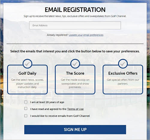
After reviewing the 13 original mandatory fields, the team pared down the list of required fields to just one (email address), deciding that none of the other information was actually needed for the email program — things such as birthday information, physical mailing address and how the customer used GolfChannel.com.
The team began working on the
registration form immediately in order to make it a one-click process.

Click here to see the full version of this creative sample
"Really what we need from you is your email address in order to get you plugged in and started. So we created a really easy-to-use, mobile-friendly sign-up page and then we followed that up with a preference center so that once you were signed up, you could manage your preferences," she said.
There are different email offerings, Castaneda said, so they wanted subscribers to be able to control what information they were consuming, and how often, in
the preference center.

Click here to see the full version of this creative sample
"We understood that process needed to be really easy to minimize the aggravation for spam," she said.
Step #2. Integrate email sign-up more clearly on the website
Another issue, Castaneda said, was that the email sign-up had only been featured on the footer of the website. The team brought it up above the fold, to be easier for would-be subscribers to find.
"Now when you go to our site, it's actually at the top above the [navigation] bar. It's a lot easier for you to find and you know immediately that there's an email sign-up," she said.
The team also added a light box to the website, she said, to "take advantage of people that are consuming content, whether they're reading an article, viewing a photo gallery or watching a video by serving them a light box and asking them to, 'Sign up for our newsletter. You can get the latest news, tips and exclusive offers.'"
The light box is a simple way to pull subscribers in, she added, because all a consumer has to do is type their email into the light box and hit subscribe, and they are automatically entered.
Integrating the light box was "keeping in mind that usability factor and making it really simple for anybody that's interested in our newsletter offering to sign up," she said.
As helpful as it could be, though, the team decided they didn't want the light box to be too intrusive. Because of that, it was decided to only serve up the light box to first-time visitors.
"We're just trying to cast a broad net amongst our GolfChannel.com consumers because they're already reading the articles we're pushing out. So why not let them know while they're engaged in an article, that tomorrow they don't have to come to GolfChannel.com and try to figure out the story of the day. We can do that for them and they can easily click it and their mobile device, get there, consume it and be done," she said.
A/B test light boxes
"We've tested different light boxes to see which ones perform better, because light boxes have different looks to them," Castaneda said.
She added that they have tested a "homepage takeover [light box], where it's an overlay over your screen, like a little pop-up. There are also some that are right or left aligned and kind of stay at the bottom of the screen as you scroll down. There are some that look like bars that go along the bottom," she said.
By testing different creatives, the team is able to see which performs higher, and if there is a correlation between light box type and response in sign-ups.
They've learned that the takeover overlay in the middle of the screen performs best, because "it's a higher visibility unit," she said.
This is a consistently evolving test, building upon incremental changes. For example, they have moved away from bars along the bottom of the screen after reviewing the "data and insights in making decisions based on the behavior we're seeing," she said.
Step #3. Encourage social media fans to become email subscribers
Golf Channel uses almost all social media channels, according to Castaneda. However, prior to this effort, nothing significant had been done to turn social media fans into email subscribers.
Once the sign-up process and the preference center was up and running, she said, they began utilizing those spaces to pull fans into the email sphere.
The digital team began by adding a tab to
the official Facebook page, "because we figured you're already engaged with us in the digital space, let's make it really easy now that we have this simplified registration form for you to sign up for our newsletter if you're reading one of our content stories and liking it or commenting," she said.

Click here to see the full version of this creative sample
They also overlaid that with ensuring they were promoting it on Twitter and Instagram, making sure that Golf Channel talent was teasing some of the content.
"If we're having a lot of content about David Feherty, one of our on-air celebrities, we would ask David, 'Help us out. Tweet out something letting your fans know that in tomorrow's newsletter, they can be featured or if they're not a part of our newsletter, they can sign up,'" Castaneda said.
She said that the digital team picked Facebook to focus on with this subscriber effort because "Facebook is all about community. So people are spending time on our Facebook page to voice their opinion. So we know people are on our Facebook page a while. They're browsing around. They're checking out our photos, checking out our videos. So why not insert email there? It was a pretty easy way to convert a highly engaged user."
Twitter was the other main branch in this step, because it is focused on news as it happens, she said.
"The newsletter, we curate it every morning and it tells you the top stories in the world of golf. So we felt like the people that follow us on Twitter would have a high propensity to sign up because we're making it really easy for them to keep on top of the game," she said.
RESULTS
This past year alone, Golf Channel was able to increase the size of its subscriber database by 32%.
Not only is the list growing, but Castaneda said customers are more engaged than ever, with Golf Channel email newsletters averaging a 40% open rate and a 60% clickthrough rate.
"Email is alive and well. People are highly interested in email. Not only are they highly interested in receiving it, but they're actually consuming it," she said.
One of the digital team's biggest goals in addition to growing the database was to make sure that engagement metrics stayed high, she added, and that open rates, clickthrough rates, page views and video views consumption "was still at least at the level that we were before we started putting all these efforts into place."
Since they have launched into this effort, "what we've seen is that we have not only grown our database, but we've actually kept them engaged and our open rates and clickthrough rates have been consistent, which is really encouraging and tells us that we're reaching the right people and giving them content they're highly interested in," Castaneda said.
Creative samples
- Golf Channel email sign-up
- Preference center
- Facebook newsletter sign-up
Sources
Golf ChannelPostUpRelated Resources
MarketingSherpa Summit 2016 — At the Bellagio in Las Vegas, February 22-24
Email Marketing 2015: The top 8 MarketingSherpa case studies for your email program next yearEmail Marketing: Prioritizing personalized email sends increases revenue 160% for Diamond Candles


