by
Ken Bowen, Managing Editor of MarketingExperiments.com
THE CUSTOMER
Voices.com is an online marketplace that connects voice talent to the projects that need them.
"Think of it almost like a virtual casting director — the people that sit on the high chair and pick and choose who's going to be on the next big show," David Ciccarelli, CEO and Founder, Voices.com, said. "We're doing that but on a daily basis for hundreds and hundreds of projects."
The company typically works with creative producers, but its clients have included a variety of businesses and organizations. Companies use the site to find a voice actor for a project, whether that be a commercial, audiobook, video game or any other number of proposals where a human voice is needed. Voices.com has been utilized by radio and television stations, advertising agencies and Fortune 500 companies.
Talent is primarily found through the site's search function, which categorizes featured talent by gender, language, accent, age range and past experience. Posting a job is similar to requesting a quote. The company outlines its project details and the service matches the company to the most qualified talent that fits what the company is looking for. This process is completed using Voices.com's pairing algorithm.
CHALLENGE
Voices.com has transformed itself into the industry leader in the voice-over marketplace. That was a title Ciccarelli wanted his company to retain when he presented at MarketingSherpa MarketingExperiments Web Optimization Summit 2014 in New York City. At the Summit, Ciccarelli was presenting
Voices.com's findings from a mobile optimization case study. However, once at the Summit, he became inspired.
According to Ciccarelli, seeing the campaigns and results of other organizations opened his eyes to the possibility of testing and the idea that testing can be an on-going process.
"It's not a one and done. It's always on," he said. "You should almost always be testing something and so, realizing how seriously people were taking this, it just seemed like an area that we needed to step up our game."
In order to remain the industry leader, it was important to Voices.com that its marketplace platform was as clear and easy-to-use as possible.
For this reason, the company decided to experiment with the Voices.com homepage. Ciccarelli and his team wanted to increase the number of sign-ups for new accounts — more specifically, double the number of sign-ups for new accounts in a month.
CAMPAIGN
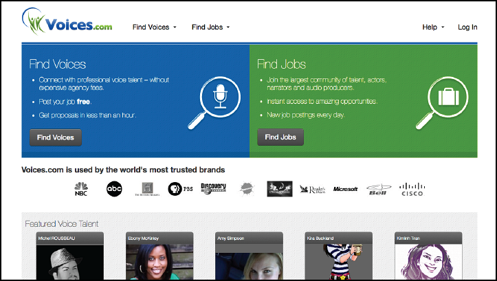
In order to generate conversions and hopefully increase account and project sign-ups, the Voices.com team launched a homepage redesign. This redesign involved lightening up the site's colors and featuring 10 voice talent profiles on the homepage.
By testing specific elements of the homepage, rather than testing radical redesigns of the site, the team hoped to optimize the sales funnel.
Step #1. Develop a hypothesis
Voices.com's original homepage featured photos and profile links for 10 professional voice actors. By prominently displaying these actors, Voices.com hoped to showcase the talent it had on its roster.
According to Ciccarelli, Voices.com is a very utilitarian website.
"People come here for one reason: to get a job done. If we profiled 10 people on our home page — five men and five women — we thought that that would be a great demonstration of the caliber of talent on our website," he said.
Because of the culture of testing at Voices.com, Ciccarelli could not help but wonder if removing the featured voice talent section on the homepage would better allow visitors to focus on the value of the website and ultimately drive more sign-ups.
Step #2. Determine your normal variance
Before any testing took place, Voices.com began by calculating the natural variation in sign-ups on any given day. Normal hourly, daily, weekly and seasonal fluctuations routinely occur in website traffic and conversion rates. These should be accounted for prior to testing.
These changes in user count and behavior on a website, which Ciccarelli compares to natural temperature fluctuations of one-to-two degrees, can skew test results if not properly recognized.
By knowing their variance (+/- 0.4%), the team can determine if changes in user behavior are statistically significant or if they are simply the result of natural ebbs and flows in the traffic patterns.
In short, Ciccarelli and his team thought of the variance as a baseline to beat and typically aimed for double-digit improvements.
A/B test
Voices.com tested its hypothesis by splitting its traffic in half and performing an A/B test.
The Control featured the original home page with 10 featured voice actors.

Click here to see the full version of this creative sample
For
the Treatment, the team removed the talent entirely so that visitors' attention would be more sharply focused on the value of the service being offered.

Click here to see the full version of this creative sample
Verify Test
If you run your test for the proper length of time and have an adequate sample size, you may get statistically significant results after only one testing cycle. That being said, when major changes are potentially involved, it can never hurt to verify your results with a second test.
"Even if we get the results back once, especially with an area as important as the homepage, I'd have rather it be as conclusive as possible … Tests are cheap. They don't cost you anything other than the time of running them," Caccarelli said.
Step #3. Interpret the results
Though A/B testing can reveal a correlation between page changes and conversion rate, it cannot pinpoint exact causation. It is up to marketers to utilize their existing customer theory to help bridge the gap in understanding between their actions and their customer's reactions.
"[Interpretation] is where it gets a little bit more philosophical," Ciccarelli said.
It's important for those running the tests to at least propose or have some hypothesis as to why the results turned out the way they did, he said, "because you can't exactly ask 10,000 people … they did vote with their clicks, that's helpful, but it tells you what they did … it doesn't tell you why they did it."
Ciccarelli said that marketers in a similar situation should start out big, and then work their way down to smaller tests.
"One thought is ... adding and removing entire sections of your homepage. We didn't just change the copy or try 10 different males or females. Test showing and hiding sections of your homepage. Then, once you have the right combination of sections, you can work on the copy within those sections or the button text within those sections … Showing [and] hiding sections is probably a really quick win."
Ciccarelli also urged marketers to make sure that their CTA paths align with the motivation of their users.
"If there's a big call-to-action, test where you're pointing that link. So, for instance, on the 'Find Voices' and 'Find Jobs,' which is our two-split screen, we are sending you down two different paths," he said. "We actually used to link to pages that would describe the service and give this explanation, four-point steps and give FAQs and have this little video on the side. It was all nice … but really when you have a [call-to-action] so strong, like 'Find Voices,' it was almost like 'get to it right now.' They don't want to learn about anything. They're like, 'I read your three bullets on your homepage. I'm good to go. Sign me up.'"
RESULTS
During the first test, Voices.com experienced 33% more sign-ups from the page that removed the talent information over the 10-day testing period. Ciccarelli re-ran the test with similar results, gaining 28% more sign-ups with the Treatment the second time around.
"We [ran] two tests to more or less validate that this is indeed what happened. Both [tests] came back showing us that, by removing these mini-profiles of the talent on the homepage, it actually increased the number of sign-ups," he said.
When interpreting these results, Ciccarelli came to two conclusions as to why the talent profiles appeared to be hurting traffic. "My theory," he said, "is that [some clients] thought that we only had 10 talents on our website. By featuring five males and five females, it was giving the impression that we were kind of like a much smaller organization … We only had English-speaking talent and we only had five male and five female."
The other aspect of that was that the auto-generated nature of the website turned some people off, Ciccarelli said.
"[Those 10 talents] were, in effect, the 10 most recently hired voice talent through this platform. So it was changing all the time and, because it's completely auto-generated, sometimes you would get … default avatar images, which just look sloppy," he said. "You'll get people with badly uploaded photos or annoying selfies or something that would be in there for the profile picture. For a brand image that we would try to maintain, we just found that it was often conflicting with that."
Creative Samples
- The Control
- The Treatment
Sources
Voices.comRelated Resources
MarketingSherpa Summit 2016 — Come experience a MarketingSherpa Summit for yourself. Reserve your seat today at the Bellagio in Las Vegas, February 22-24
Marketing Mashup: Top takeaways from Web Optimization Summit 2014Mobile Marketing: How Voices.com involved its customers in a responsive design campaign [video] [From the MarketingSherpa blog]
B2B Web Optimization: 140% surge in mobile transactions through responsive design effort


