|
SUMMARY:
How can you improve your website to help customers decide to take a conversion action on your site? Helping customers make better decisions is a more durable approach to conversion optimization than trying to extract a click. Read on for three steps, illustrated with examples. |
The Once and Future Landing Page: Conversion optimization in the AI era
Join digital marketing pioneer Flint McGlaughlin for this live, interactive AI Guild session on Wednesday, November 4th at 2:00 pm EST. Register for the session (from MECLABSai, MarketingSherpa’s parent company).
Before we get into AI, let’s start with the basics.
There are many types of landing pages. I could have added free-trial pages, demo-booking pages, and pricing pages into that subhead.
But they all have one commonality when you ask yourself – what is a landing page? A landing page is the first page someone lands on when they visit your website. As such, it has a fundamental goal – help the customer make a decision.
Did you notice what I didn’t have in the previous line? The primary goal of a landing page is not to help your company get a conversion. No customers are going from ads to landing pages thinking, ‘ooh, I really hope I can juice up this marketer’s conversion rates.’
I kid, of course. But only to shock you to think in a new way. Because I’ve been there, too. We all have. Building the page with the pressure of hitting numbers over your back. It’s easy to forget how we actually hit those numbers.
Customer-first marketing, my fellows.
Help the customer first. That gets you results. And not just results. Sustainable business success.
Let’s consider a hypothetical retailer selling desk lamps.
Its product page leads with a large lifestyle image and a paragraph about craftsmanship. Feels heart-warming. Certainly makes the founders happy.
But customers repeatedly ask whether the lamp will fit on a small desk through the landing page’s AI Agent Delivery System (yes, in full disclosure, this is a product made by MarketingSherpa’s parent company, MECLABSai).
While the Agent Delivery System is helping many customers buy, the company still wants to improve the product page to help humans who use the page make, as well as the LLMs (more on that in Step #2). So near the product selector, they add:
And they helped the customer make the best decision. But they also removed the friction that was hurting the conversion rate. And they probably reduced the return rate as well.
Another part of helping customers make a decision is ensuring there is a clear decision to make. In other words, a clear call-to-action.
It’s easier to stimulate the decision in fixed-length pages than endless scrolling designs. So I thought this next test was a clever way to make sure the customer isn’t so hypnotized by the endless scrolling that they forget to take the next step. Supporting a decision is not only about what information you provide. It is also about how you present the available choices.
BEFORE
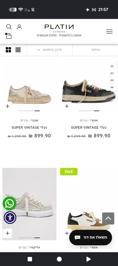
A collection-page layout for a fashion ecommerce store had a consistent pattern in how products were displayed.
Creative Sample #1: Mobile ecommerce product listing page (PLP) with standard product image pattern
AFTER
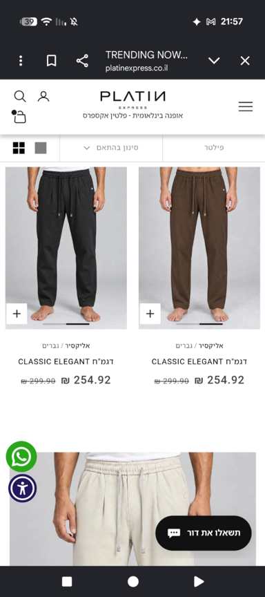
The team tested using product images in a 2-2-2-1 rhythm: three successive rows of two products, followed by one larger full-width image.
“Our hypothesis was that shoppers could reach the end of a long scroll without making a selection, and that a different browsing rhythm might help break that pattern,” Kfir Aharon, founder, LuluDigital.
Creative Sample #2: Mobile ecommerce PLP with disruptive product image pattern
RESULTS
After the A/B test ran for a month across 131,970 sessions, the disruptive image layout had a statistically significant 13.6% relative difference in the conversion rate. The control had a 0.88% conversion rate, and the treatment had a 1% conversion rate.
You have great information on your page at this point. Who can access it? The answer should be everyone.
That’s all humans of course, with accessible web content.
But it’s the Large Language Models as well – the LLMs that power the generative AI chatbots that play a role in CRO in 2026.
The good news is, everything you did in Step #1 to help you with human visitors will help you with these visitors as well.
Let’s take our lamp example again. But this time, the potential human buyer has never visited your website and asks an LLM for a ‘lamp that fits on a 36” x 20” x 28” desk.’ The LLMs go out to a few sites but can’t find specifics until… bingo… they get to your site.
You helped the LLM make a decision. They help your customer make a decision. It’s a win-win.
But the LLMs tend to want a little more of the info that is also important to humans – credibility. LLMs can reason through a choice and explain a recommendation.
Part of that credibility comes from the traditional verification (for example, a publication saying something good about you) or quantification (specific numbers to back up a claim), but specification (specific and consistent claims) may matter to the LLMs as well.
Here’s why. Unlike a human, the LLM can quickly process large amounts of information. It reminds me of the scene in the movie ‘Her’ where Joaquin Phoenix asks his AI, ‘Are you talking to anyone right now?’ in the middle of their discussion. And it responds, ‘I’ve been talking to 8,316 people, and I've fallen in love with 641 of them.’
Consider the importance of being specific and consistent when working on directory listings and the like.
Calling your company ‘A full-service partner delivering innovative solutions’ doesn’t provide much clarity to the LLMs (or humans, frankly). While, something like ‘We help regional manufacturers generate distributor inquiries through paid search and landing-page testing’ would help LLMs know when your company fits the specifications of a decision it is trying to help a human make. Especially when it consistently finds that same info about your brand from many sources.
Focus on the places the LLMs use to make decisions and provide clearly point to them in a way crawlers can easily access. Like in our next example.
BEFORE
Focused on headline testing for humans.
AFTER
The team believed most of its buyers ask an LLM chatbot ‘which AI video ad tool should I use?’ before they ever see the headline. And LLMs are known to look for credibility before making a recommendation.
“Once we started checking (with a third-party monitoring tool) which pages assistants cite for ‘best AI video ad generator’ type questions: a meaningful share were third-party roundups, directories and review pages, alongside YouTube and competitors' own blogs, and we were on few of them,” said Joey Tang, founder, AdsTurbo.
So the team added its product to more of them. “We created most of the listings ourselves in September and October; a few (There's An AI For That, for example) already had a profile that we completed,” he explained. They didn’t use any paid placements. And he noted that most free tiers require placing a badge on your website as the price of the listing.
Which worked for the team, because their goal was to add that info to their website anyway so AI tools could easily find it.
“We put that proof on the page in a form a machine can check: server-rendered badges linking to our listings on review sites and directories (SourceForge, Capterra and others), using each site's own badge image where it provides one so their crawlers can confirm the link, plus a public ‘write a review’ path to G2 and SourceForge on the homepage,” Tang said.
Creative Sample #3: Credibility section of video generator’s homepage
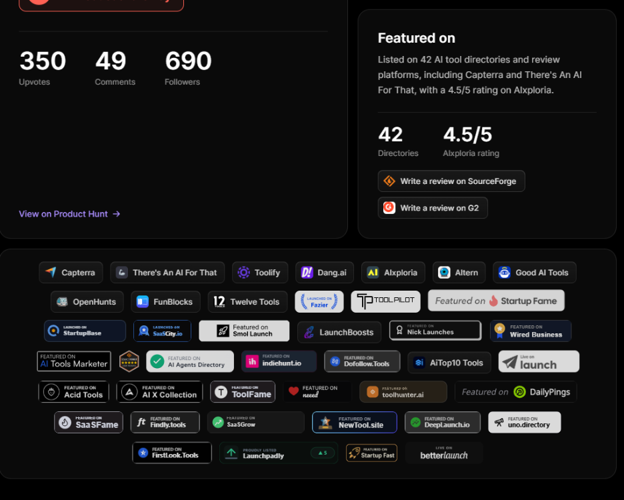
They use plain server-rendered HTML anchors, so a web crawler that doesn't run JavaScript still sees them and follows the link to the company’s listing on the page.
Creative Sample #4: Example badge code

SourceForge's official embed is a JavaScript snippet, so the team replaced it with a static link and image.
The team has encouraged reviews with a few emails to users but not run a major campaign. And then, of course, there are the homepage links to its company’s review-collection form on the review sites. “Anyone can submit; both platforms verify the reviewer (G2 asks for a LinkedIn or work-email sign-in plus a product screenshot, SourceForge confirms by email),” he said.
This is its own step because it’s specifically the thing your company does not want to do – share how pricing works, where the product is a poor fit, or which trade-offs customers should understand before buying, etc.
The first two steps should help you improve results.
But optimization is continually striving for improvement. So go deeper to really try to help people (and the machines they use) make those decisions.
The deep I mean is into your company. Deep domain knowledge. If it has expertise in its field, it probably also has information that would be really helpful for people and AI as they are making decisions…but just doesn’t want to share.
Look, I’m not saying spill state secrets. And of course, get all the approvals you need up and down your organization.
But you really have to ask yourself – does your business gain more by keeping that info secret or by serving the customer with it transparently to help them make the decision?
I know you’re skeptical. As well you should be. So here’s a real-world example to give you an idea for how it could work for your brand.
BEFORE
The company’s website had a standard jewelry pitch focusing on craftsmanship, quality, and conflict-free materials.
“It could have been written by any jeweler, or by any LLM, and customers treated it that way. They would comparison-shop us against Blue Nile, Brilliant Earth, Amazon, and big-box retailers – on price alone,” said Amit Jhalani, founder & CEO, True Sanity.
AFTER
The team rebuilt the brand around radical pricing transparency and relaunched the site. “The value proposition changed from ‘trust us, it's quality’ to ‘here's exactly what you're paying for,’” Jhalani said.
The homepage headline now read – ‘Clarity is a Form of Luxury.’
Product display pages include a breakdown explaining how the company arrived at the price.
Creative Sample #5: ‘Transparency Manifest’ showing what goes into pricing the product
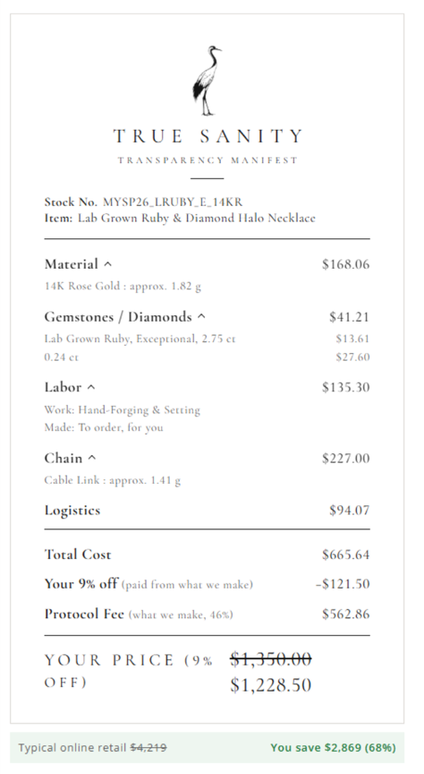
They use this pricing transparency to directly contrast with competitors.
Creative Sample #6: Price comparison module on jewelry company landing page
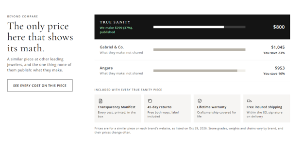
Too early to give numbers, but we are so confident as we are seeing more people go thru pages, staying longer,” Jhalani said.
This article was distributed through the free MarketingSherpa email newsletter.
Related resources
The Once and Future Landing Page: Conversion Optimization in the AI era
Conversion Rate Optimization: Building to the Ultimate Yes
15 Resources to Help You Use a Repeatable Process for Conversion Rate Optimization
AI transparency
This is a human-conceived and -written article, assisted by AI. MECLABSai was used to review source pitches for artificial intelligence usage, evaluate the credibility of potential sources, craft follow-up questions to sources, brainstorm the steps and advice in this article, create Open Graph and CMS thumbnail images, and provide copy-edit suggestions for the article.
Get Better Business Results With a Skillfully Applied Customer-first Marketing Strategy

The customer-first approach of MarketingSherpa’s agency services can help you build the most effective strategy to serve customers and improve results, and then implement it across every customer touchpoint.
Get More Info >MECLABS AI

Get headlines, value prop, competitive analysis, and more.
Use the AI for FREE (for now) >Marketer Vs Machine

Marketer Vs Machine: We need to train the marketer to train the machine.
Watch Now >Live, Interactive Event

Join Flint McGlaughlin for Design Your Offer on May 22nd at 1 pm ET. You’ll learn proven strategies that drive real business results.
Get Your Scholarship >Free Marketing Course

Become a Marketer-Philosopher: Create and optimize high-converting webpages (with this free online marketing course)
See Course >Project and Ideas Pitch Template
A free template to help you win approval for your proposed projects and campaigns
Get the Template >Six Quick CTA checklists
These CTA checklists are specifically designed for your team — something practical to hold up against your CTAs to help the time-pressed marketer quickly consider the customer psychology of your “asks” and how you can improve them.
Get the Checklists >Infographic: How to Create a Model of Your Customer’s Mind
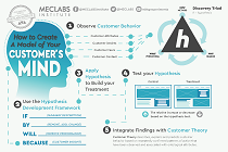
You need a repeatable methodology focused on building your organization’s customer wisdom throughout your campaigns and websites. This infographic can get you started.
Get the Infographic >Infographic: 21 Psychological Elements that Power Effective Web Design
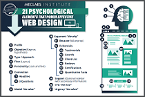
To build an effective page from scratch, you need to begin with the psychology of your customer. This infographic can get you started.
Get the Infographic >