|
SUMMARY:
Small, smart tweaks can meaningfully lift conversion without changing your product, price, or offer. But not just any small change will work. The change needs to have an outsize impact on customer perception. Get ideas for how to come up with these low-effort, high-impact changes by reading this breakdown of what worked for your peers. |
[Action Box] Transparent Marketing, Part 2: How to earn the trust of a skeptical machine
In the age of LLMs, this timeless principle is even more important to driving revenue. Join us for a free AI Guild session on Tuesday, October 13th at 2:00 pm EDT. Register now (from MECLABS AI, MarketingSherpa’s parent company).
Many marketers and entrepreneurs put their messaging emphasis on features, benefits, outcomes, claims, etc. But they overlook an opportunity to communicate what their brand doesn’t do.
Specifically, the things you don’t do that customers are anxious about.
If they are buried in your company’s businesses processes but you haven’t surfaced them in your marketing, you have an opportunity.
For example, if your company audits partners, tell customers that there are ‘no unapproved suppliers.’ If your product packaging blocks UV, mention ‘no light degradation.’ If you offer month-to-month pricing, make sure prospects understand that there are ‘no annual contracts.’
Here’s a real-world example of simple copy change that helps alleviate a key customer anxiety.
BEFORE
From January to June 2026, the team sent a direct mail postcard that sounded like typical homebuyer direct mail pieces. The copy included terms like ‘fast closing,’ ‘fair cash offer,’ and ‘any condition.’
AFTER
In July 2026, they made a change.
“The most effective word on our new postcard may have been ‘no,’” said Mike Plactere, owner, We Buy Long Island Homes Fast.
The new postcard opens with three negatives:
“They came straight from what Long Island sellers tell me they're afraid of,” he said.
RESULTS
The mailing criteria, neighborhoods, and schedule remained the same, the only meaningful difference was the copy change.
The old postcard was mailed to 103,599 households and generated a 0.24% response rate (the desired conversion was a phone call).
For the new card, 32,944 pieces were mailed and conversion reached 0.29% – a 21% relative lift.
Appointments also rose 17%, and one ultimately became a signed contract.
“I named the exact behavior sellers were already worried about and took it off the table,” Plactere said. “The rewrite took one round, and most of the work was subtraction. If a competitor could make the same claim, we removed it. What survived were the three negatives and my CPA license.”
I get a lot of pitches to the journalist queries I post to find sources for MarketingSherpa articles like this one.
I get many responses where I can tell their main focus is using earned media for SEO (and now AEO/GEO) by getting a link.
But how much are these brands leveraging media mentions to build credibility to their own audiences? Are they turning these mentions into a trust asset?
It only takes a small change to leverage an earned media mention to get more out of it (after, admittedly, the major effort it takes to earn a media mention). But when your brand is featured by a truly reputable publication, it can be a strong trust signal in your ideal prospect’s mind. Being vetted by an established newspaper, magazine, broadcaster, or online publication provides a powerful trust signal.
Here’s an example.
BEFORE
Weighted pillow company sent its pillows to influencers. They sent 15 pillows, which resulted in approximately four purchases based on their limited tracking
AFTER
“What really changed for me was starting to reach out to media myself. I started cold emailing, pitching, and honestly just reaching out to as many possibilities as I could find. It cost me my time instead of giving away a $200 product, and I started to realize that every media opportunity gave Calmily something beyond just getting in front of more people. It gave the brand another little layer of credibility and, I think, trust,” said Libby LePinnet Kelly, DPT, founder, Calmily.
When she got her first major media opportunity, Kelly made the most of it.
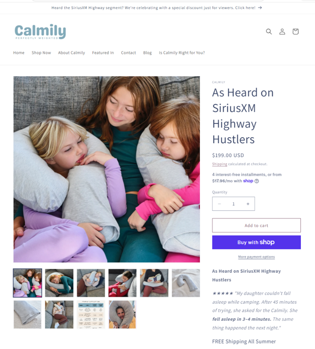
“In early July, I was featured on SiriusXM’s The Highway,” she said. “Instead of letting the credibility from that interview disappear after it aired, I brought it onto my website. I added ‘As heard on SiriusXM’ prominently and created a page where people could actually listen to the interview and learn more about me and why I created Calmily.”
Kelly added an announcement banner message to the top of her website about the interview – ‘Heard the SiriusXM Highway segment? We’re celebrating a special discount just for viewers. Click here!’
Visitors who clicked on this banner were taken to a product display page that heavily referenced the interview.
Creative Sample #1: PDP highlighting satellite radio interview
RESULTS
From January to June 2026, the weighted pillow company had eight total orders.
The segment aired on July 1st. Kelly added it to her site the same day.
In the first two days, the site received 22 orders.
But it got eight orders the rest of the month – the same amount in the entire first half of the year – suggesting something happened after the initial pop of customers coming straight from the interview.
The interview itself led to an increase in traffic. And the motivated audience from the interview itself may have helped with a 65% increase in conversion rate.
But leveraging the media feature on the site likely played a role as well. “I had spent so much time thinking I needed to explain the product better. What I realized was that I also needed to give people a reason to trust what I was telling them,” she said.
There’s a lot of info most brands want to tell their prospects. But most prospects will only give you a few moments of their attention…if you don’t give them a reason to keep reading, listening, or watching.
The solution – value sequencing. Understanding not just what your prospects need to know, but in what order you need to tell it to them so they want to continue the journey with you.
For example, if you told me your electric car had a 200 kWh batter with 9.6 kW battery output, my eyes might gloss over and you’d lose me. But if you first told me the electric car could serve as a backup battery if my house loses power, I might lean in to hear what you have to say next. That’s the difference between a data dump and guided understanding.
Journalists have a great saying to describe this phenomenon – ‘don’t bury the lede.’
Here’s an example of a simple change – the company didn’t alter the product, price, or download buttons. They simply changed the order of what’s on the page to better guide visitors through a journey…instead of just hitting them with a bunch of data up front.
BEFORE
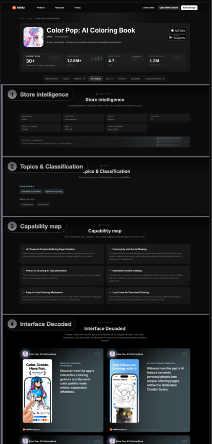
MWM’s website has a directory with 266,000 apps. Each app had a descriptive app detail page on website which the team refers to as an ‘editorial app page.’
In the initial versions, the pages opened with metadata (a section called ‘Store Intelligence’) and a row of tags – essentially category info and labels about the app.
When the team reviewed the pages’ metrics, they realized sections farther down the page were getting more engagement.
Creative Sample #2: Top of an editorial app page, before
AFTER
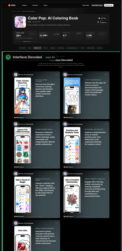
The team reordered the pages so those sections – which were the most decision-helpful content – appeared earlier.
They opened the pages with an editorial preview (a section called ‘Interface Decoded’), then had features (‘Capability map’), an FAQ (‘Quick answers’), and reviews (‘Customer Reviews’). Metadata was still included on the pages, but it was moved lower.
Creative Sample #3: Top of an editorial app page, after
RESULTS
Comparing successive two-week periods, the conversion rate (clicking the ‘download’ button) increased 9.8%. From July 15th to 29th, 2026, there were 245,239 visitors with a 15.65% conversion rate. For the next 14-day period (after the change), there were 264,319 visitors and a 17.18% conversion rate.
It’s also interesting to note that the conversion rate of engaged visitors (a visitor with at least one qualifying interaction) was essentially unchanged – 57.93% before vs. 57.95% after. So the increase didn’t come from better persuading already engaged visitors, it came from getting more people to engage. The engagement rate grew from 31.99% to 35.24% – essentially, getting more people to read the page.
“The question is not which sections to add or change. It is which one is seen first,” said Maxime Doussin, chief technical officer, MWM.
Does your design catch attention? Or fade into the background? If you’re just using a generic template to take up space, you’re wasting one of the tools you have to catch your prospect’s attention.
It reminds me of the classic Isuzu Rodeo ad showing kids coloring in a classroom while a teacher intones, ‘Stay within the lines. The lines are our friends.’ One young girl does not follow this advice, coloring all over the page. Record scratch, cut to her as an adult, taking her SUV off-road, with the announcer intoning that this vehicle is ‘The world's first V6 Crayon.’
Breaking with conformity catches attention.
When our team designed MECLABS AI’s Agent Delivery System, they built it so users could put AI agents on their landing pages and websites with avatars that broke out of the traditional lines of the box and hovered over the website in a way that would grab attention (MECLABS AI is the parent company of MarketingSherpa).
Creative Sample #4: Box-breaking avatar design for MECLABS AI’s Agent Delivery System
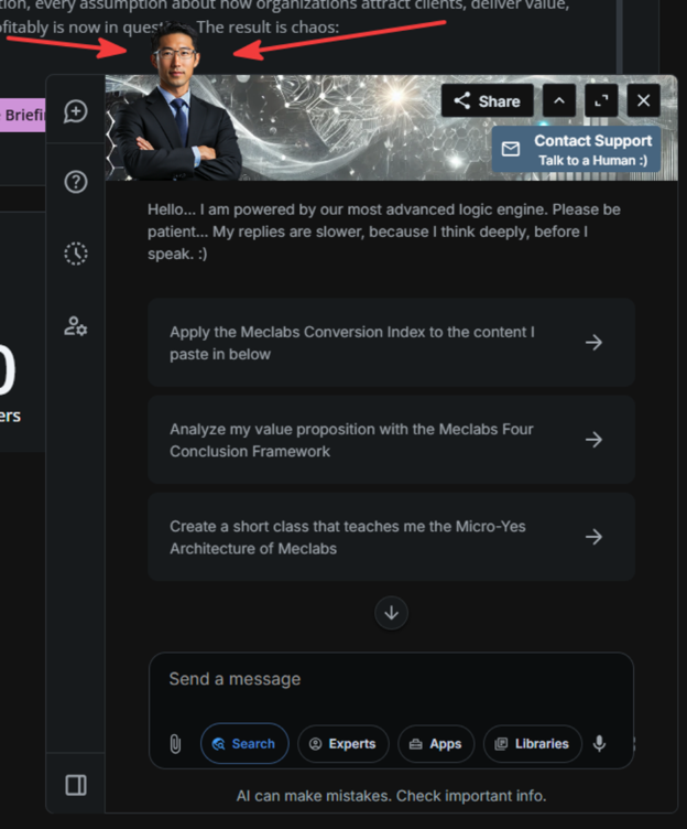
Even though this is a relatively small design change, it can be majorly disruptive in how the user views a page and, thus, grab their attention.
Here’s another example of how non-conformity in design can better engage the visitor.
BEFORE
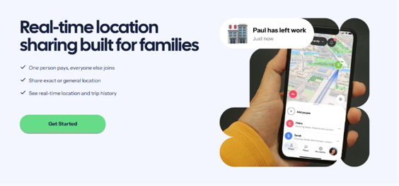
The app’s feature page had a typical square hero image with rounded corners above the fold.
AFTER
The designer changed it to an image cropped into an odd, non-standard shape.
Creative Sample #5: New hero with untraditional image crop
RESULTS
In the month before the change, the page had 1,344 sessions with a 6.1% clickthrough rate from feature page to pricing page. In the month after the new image was implemented, the page had 1,293 sessions and the CTR increased to nine percent – a 47% increase.
“We put mouse tracking on the pages and saw cursors were moving toward those odd-shaped images specifically,” said Phil Forbes, head of search, HeyPolo. “We think that the shape bought us an extra second of attention, and that second is what got people to actually read the copy next to it instead of scrolling past.”
This article was distributed through the free MarketingSherpa email newsletter.
Related resources
Conversion Optimization Strategies: Ways to get started overcoming 6 CRO challenges
Conversion Rate Optimization: Four examples of writing and design changes that improved results
Conversion Rate Optimization: 7 tips to improve your ecommerce conversion rates
AI transparency
This is a human-conceived and -written article, assisted by AI. MECLABS AI was used to review source pitches for artificial intelligence usage, evaluate the credibility of potential sources, craft follow-up questions to sources, brainstorm the steps and advice in this article, create Open Graph and CMS thumbnail images, and provide copy-edit suggestions for the article.
Get Better Business Results With a Skillfully Applied Customer-first Marketing Strategy

The customer-first approach of MarketingSherpa’s agency services can help you build the most effective strategy to serve customers and improve results, and then implement it across every customer touchpoint.
Get More Info >MECLABS AI

Get headlines, value prop, competitive analysis, and more.
Use the AI for FREE (for now) >Marketer Vs Machine

Marketer Vs Machine: We need to train the marketer to train the machine.
Watch Now >Live, Interactive Event

Join Flint McGlaughlin for Design Your Offer on May 22nd at 1 pm ET. You’ll learn proven strategies that drive real business results.
Get Your Scholarship >Free Marketing Course

Become a Marketer-Philosopher: Create and optimize high-converting webpages (with this free online marketing course)
See Course >Project and Ideas Pitch Template
A free template to help you win approval for your proposed projects and campaigns
Get the Template >Six Quick CTA checklists
These CTA checklists are specifically designed for your team — something practical to hold up against your CTAs to help the time-pressed marketer quickly consider the customer psychology of your “asks” and how you can improve them.
Get the Checklists >Infographic: How to Create a Model of Your Customer’s Mind
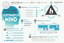
You need a repeatable methodology focused on building your organization’s customer wisdom throughout your campaigns and websites. This infographic can get you started.
Get the Infographic >Infographic: 21 Psychological Elements that Power Effective Web Design
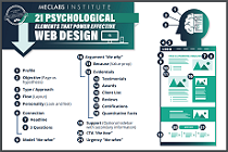
To build an effective page from scratch, you need to begin with the psychology of your customer. This infographic can get you started.
Get the Infographic >